McCrackus
TPF Noob!
- Joined
- May 6, 2011
- Messages
- 15
- Reaction score
- 0
- Location
- Austin, TX
- Can others edit my Photos
- Photos OK to edit
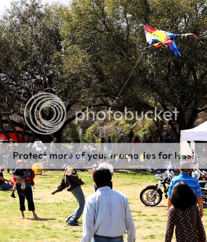
Thanks to everyone for their help with my first post about my 50mm lens. Now that I'm here, I thought I'd post some pics for feedback, since I've seen some other people upload pics and get very helpful criticism.
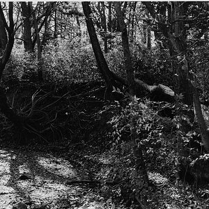
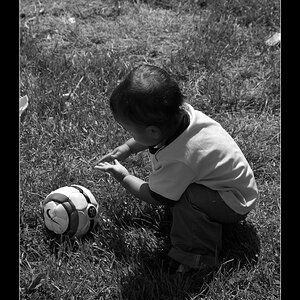
I wouldn't necessarily call myself a beginner, but almost all of my shooting experience is concerts, so I've been trying to expand my palette and practice shooting other environs. Let me know what you think!
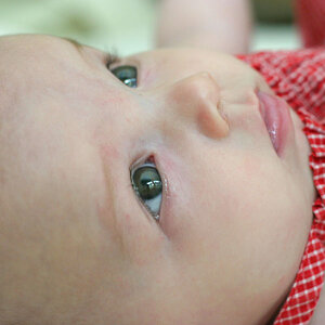
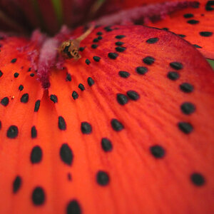
1.
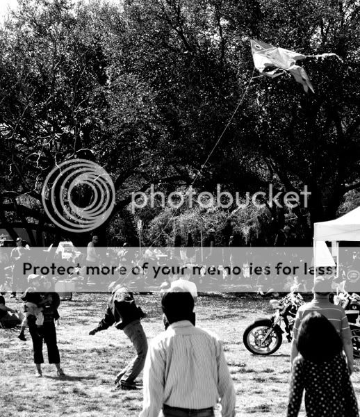
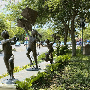
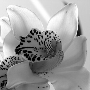
2.

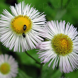
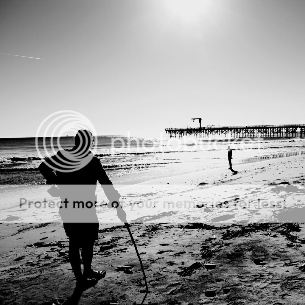
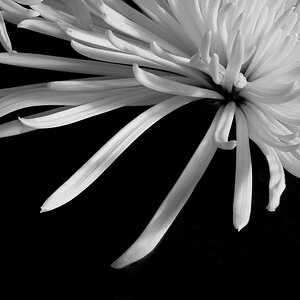
3.
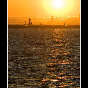
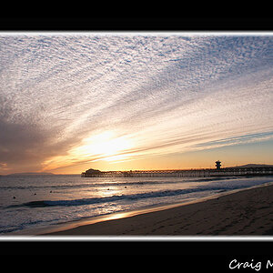
4.
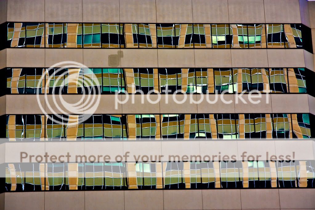
I know #4 is crooked, kicking myself for not being more careful. Just kinda like the idea.
Thanks, everyone!
I wouldn't necessarily call myself a beginner, but almost all of my shooting experience is concerts, so I've been trying to expand my palette and practice shooting other environs. Let me know what you think!
1.
2.
3.
4.
I know #4 is crooked, kicking myself for not being more careful. Just kinda like the idea.
Thanks, everyone!

![[No title]](/data/xfmg/thumbnail/37/37095-648a4e65f10e6fdeeb231be5ed8c3152.jpg?1619737881)