Chairman7w
TPF Noob!
- Joined
- Jan 21, 2009
- Messages
- 301
- Reaction score
- 0
- Location
- Sacramento, CA
- Can others edit my Photos
- Photos NOT OK to edit
I'm usually the one asking for the c&c, so pardon my noobtastic opinion, but... in #1 the composition is distracting because I think you either needed to get in closer on your subjects, or, not. The line of the edge of the mantel right above their heads, and whatever it is that's sitting on it (a basket or something), is distracting. It would be better if it was all brick above their heads, or if you were zoomed out and gave some perspective as to what's behind them.
Good point Silltime, i see exactly what you're referring to there. Thanks!
EhJsNe, I've had that problem before (too much green), I wonder if I'm slightly colorblind? (seriously) Morelikely it's the wonky lighting at my place.
I did check out some strobists info on Youtube last night and I will definitely be picking a sync cord to use the flash off camera, and maybe an umbrella, too.


![[No title]](/data/xfmg/thumbnail/37/37126-93feffeca0e9e6ad893962c03a7a341e.jpg?1619737884)

![[No title]](/data/xfmg/thumbnail/36/36650-edd8c21212fe9fbd7e59bfb08cdc91ea.jpg?1619737672)

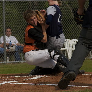
![[No title]](/data/xfmg/thumbnail/32/32717-74f4cee577117aa4476c9eb68fec51c7.jpg?1619735622)
![[No title]](/data/xfmg/thumbnail/32/32719-7d42e7d7077540fabb3fa0275a99899a.jpg?1619735625)
