Really great lighting and natural expressions. Her eyes stand out very well. I love the fun feel to the last photo as well. The only thing I find a little distracting is the wrinkles in the white backdrop. That's a matter of personal preference though
The exposure looks pretty good in all of them, but I have never been a big fan of butterfly lighting, but to each his own. The first image (IMHO) is the best. In all of the others she is sitting straight up and down and straight up and down usually looks boring in a photograph. Leaning her body and tilting her head gives the image some action and prevents the static straight up and down 'Olin Mills' look, especially when using flat lighting.
I don't know if you remember when I showed you these before when I first did them. I had to change the color of the cap to match the gown because I had rented them and the cap was navy and the gown was royal. So, yes I messed with the hue and saturation on the cap. However, I did not mess with the colors on the gown.........
I am mobile so I work in limited space in people's living rooms. Some are larger than others. This one happened to be rather small. I only had half a foot between her and the backdrop.
The exposure looks pretty good in all of them, but I have never been a big fan of butterfly lighting, but to each his own. The first image (IMHO) is the best. In all of the others she is sitting straight up and down and straight up and down usually looks boring in a photograph. Leaning her body and tilting her head gives the image some action and prevents the static straight up and down 'Olin Mills' look, especially when using flat lighting.
As for the 'Olin Mills' look, that's what they asked for. I gave them what they wanted.
I wanted to get a little more creative with it, but they were pretty stuck on the 'standard' portrait look. (with the exception of the last there was nothing out of the 'standard' frame at all)


") Well done.
Well done. I gave them what they wanted.
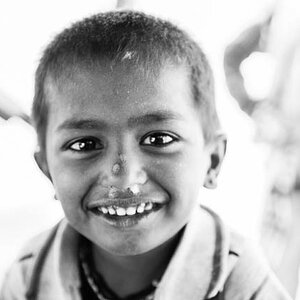
![[No title]](/data/xfmg/thumbnail/42/42397-30faa170de7ed9be38adf00b9b26a220.jpg?1619740167)
![[No title]](/data/xfmg/thumbnail/36/36682-50d0684eabff70509e27d7061c265146.jpg?1619737677)
