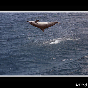
ok, heres teh picture. it looks great, but i just feel like there's something missing, if you'd like to see the original, or play with it a bit, just give me your email and it'll be off
I agree, it looks great technically, but it just doesn't quite do it for me. I think my problem with it is that it reminds me of the windows xp default wallpaper And maybe the horizon is a bit too close to centered???? Aside from that, the picture is excellent, keep up the good work!
WhileI think this suggestion crosses the line from Photography to Digital Imaging I would suggest finding something to paste into the foreground using Photoshop. If you took a photo of something relevant in similar lighting conditions it should be a fairly seamless integration.
It is an amazing picture in regards to colors and contrast but as soon as I ask myself what the subject is I'm scratching my head a bit.
I know people will look down on this (including myself to a degree) because you're creating something later on that wasn't in the original frame but I'd say as long as you're not saying it's a genuine photo, who cares. It's not like you're killing puppies or anything.
Remember the old principle, that a picture should tell a story, i.e. If you put a caption to your shot, what would it be?? Do you get my point, it's difficult to put a name to it. Sorry to be blunt, but it doesn't say anything.
I actually think that if you had simply lowerd yourself a little and made the plant (corn?) the subject with the horizon a little higher it would help tremendously without completely changing the idea.
Its not that bad, only has a few problems, (1) the framing the bottom seems odd IMO, seeing the ground may have helped some: (2) did you think about a fake panoramic crop off the top (3) colors have an old slide look to them, was that you wanted if not play with the levels in PS (4) try a B&W convention
if you had tilted your camera up about 5-10 degrees and to the left slightly, I think it would look great. It's a very nice landscape shot, but for plain landscapes the thirds rule is very strict. If the ground a little more than a third it kinda ruins the shot. Usually for these types of pictures I like to do an extreme seperation and do something like 1/8th of the bottom is the ground, and then a LOT of sky. I hope I'm explaining this right, it sounds good in my head.
EDIT: since i didn't feel I explained it well enough, I did a quick crop up to give a basic idea. Obviously if I wanted to do it right I would have PSed the center of the field out so that you would still have the amber showing through at the bottom, but this is a quick little show. Also I lowered the Red level and bumped up the blue level a little, -12 and +24 respectively. This was all done in FastStone Image Viewer in about 1 minute.
If you dont want me to use your image let me know and I'll remove it immediately.


 And maybe the horizon is a bit too close to centered???? Aside from that, the picture is excellent, keep up the good work!

![[No title]](/data/xfmg/thumbnail/37/37138-63809b91a8061d61d48c541f18a69861.jpg?1619737885)


![[No title]](/data/xfmg/thumbnail/37/37128-189b79232a3c6bf0c2c530e4eea0b8cd.jpg?1619737884)