Still life - C+C please

EckoZero

TPF Noob!
Joined
Mar 2, 2011
Messages
190
Reaction score
12
Location
Folkestone, Kent
Can others edit my Photos
Photos OK to edit
Here's some still lifes I took.

I'm looking to improve on my technique so any C+C is greatly appreciated :)


1.
5510338404_657f3bb19c.jpg


2.
5448124411_18c9356775.jpg


3.
5448682374_26f967ee92.jpg


4.
5440684555_bc15a27638.jpg


5.
5432108884_2840977a4b.jpg
 
Keep #5... chunk the rest.

#1... the focus appears to be on the couch, just in front of the glasses. I find myself chasing the little lines in the leather. I would like this one better if the entire thing was soft, and the other side of the glasses were in the frame.
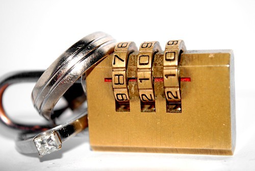
#2... The end of the lock is chopped off. Also I find myself trying to focus on the ring and the numbers on the lock at the same time.
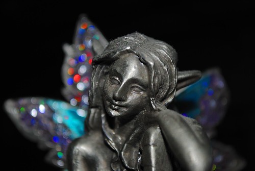
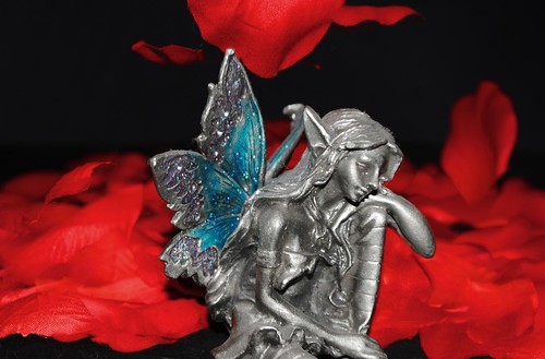
#3 & #4... Look like snapshots due to the lighting, and subject matter.


#5... is really nice. I like the shallow DOF, the lighting is nice and smooth, and I like the product placement. I might check your WB, as the white looks a tiny bit blue from what I'm seeing, but overall nice job on this one.
 
Thanks Christopher. Do you have any suggestions for how to improve the lighting on 3 and 4?
Also, with number 2 if - got the end of the lock in the shot which do you think would work better - numbers or rings in focus?

Might have a play around with that and see if it works better either way...
 
Thanks Christopher. Do you have any suggestions for how to improve the lighting on 3 and 4?
Also, with number 2 if - got the end of the lock in the shot which do you think would work better - numbers or rings in focus?

Might have a play around with that and see if it works better either way...


I would preferrably like to see the rings in focus, than the numbers. It would be a little more suggestive that way. I suppose it would work the other way as well.

The lighting on #3 and #4 looks like the flash is on your camera. Have you tried moving it to camera left or right, and filling with a reflector opposite your flash?
 
#1: Purely an abstract ...and abstractions are beyond criticism-some would like it; others won't. Watchers will feel possible modifications as per their creative talents. i too have, but i hold them back ;) . Ofcourse i liked it as such.

#2; i did not liked it, sorry

#3: I liked the way you kept the colored jewels out of focus giving prominence the face of angel. Metallic surfaces are always challenging to photograph, with respect to lighting.

#4; That was your style; i would love to have the whole figure in the frame because how she places her feet would have accentuated her attitude/mood; i liked the background very much

#5: Doubtless, very good; at the same time, it would be treated as a case study of Depth Of Field, since it is a countless repeated concept

All The Best
 
One more shot today...

I wanted to do this top down but Bicycle playing cards are so shiny that the flash just obliterated the exposure regardless of the flash power...


5526981972_1b100f304d.jpg


EDIT: Dammit, I straightened this by eye in GIMP and it's still crooked!
 
Last edited:

Most reactions

Back
Top