
Sk8man
TPF Noob!
- Joined
- Apr 28, 2004
- Messages
- 472
- Reaction score
- 1
- Location
- At the skating arena...
- Website
- sk8man.photosight.ru
- Can others edit my Photos
- Photos NOT OK to edit
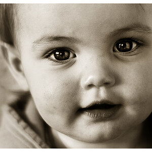
need serious critics. be "cruel"
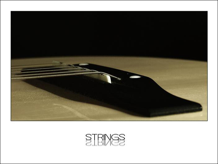
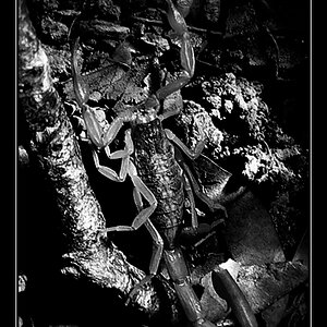
version 2
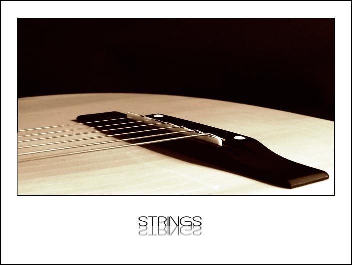
version 2
![[No title]](/data/xfmg/thumbnail/40/40292-bee9ec3dc0cd7f6c47df7466ae1fa3d2.jpg?1619739409)
![[No title]](/data/xfmg/thumbnail/42/42349-fa3065c4e047f0114ec8715d9168dff9.jpg?1619740147)
![[No title]](/data/xfmg/thumbnail/32/32635-be18e952e67667cbb1525b4b057b6423.jpg?1619735554)
![[No title]](/data/xfmg/thumbnail/33/33028-42917987307dfd2eb37ddccec6dcb655.jpg?1619735842)