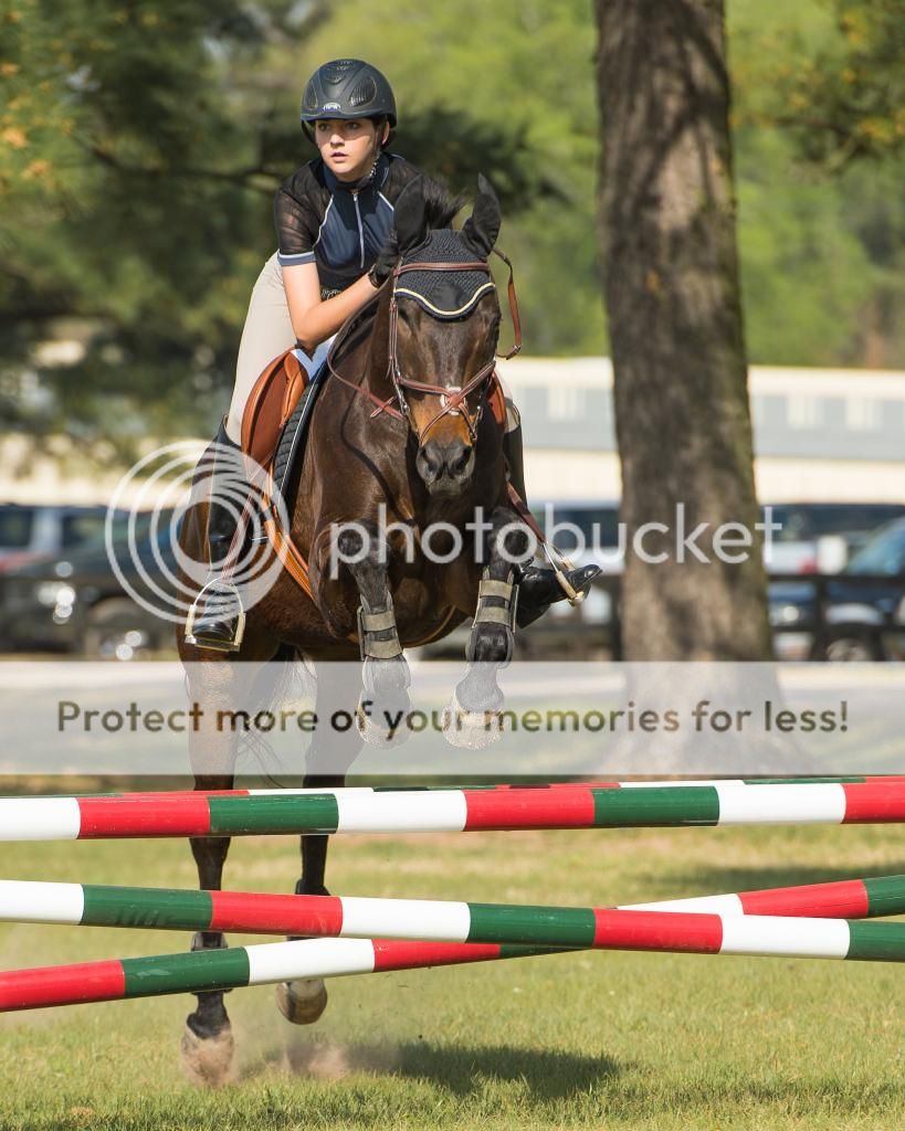
It's a nice shot, full of energy but flat as a board. well, perhaps not that flat but it isn't particularly hilly either. Go back and reset your white, black and gray points. I would use the darkest area under the blanket on the rider's right side for my black, the white on one of the cross poles for the while point and probably somewhere around the the area where the rider's right foot is near the top of the stirrup. That alone will do more for this image tahn most anything else you can do. Should just make those colors pop right up, give better separation between the colors and a bit more contrast overall. I'd probably also be inclined to lose more off the right side of the frame.
ceeboy14 - Thanks for the observation. I must admit i find it interesting as I muted the reds and greens so as not to overshadow the darker horse and rider combination. I will go back to the original file and add back the colors as shot, then repost for comparison.
Very close to what I came up with. I still think you could stand to lose a bit off the right side of the frame. It really isn't helping to frame the shot.