Sweet Tooth!!!!!

TommiP

TPF Noob!
Joined
Jul 29, 2006
Messages
122
Reaction score
0
Location
Shrewsbury, UK
Website
www.bt-photography.com
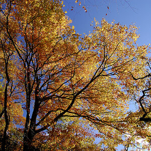
Just taken these and wanted to post them for some comments.
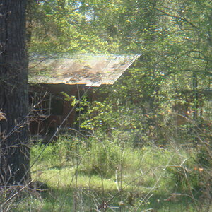
Please say what you think and where i am going wrong. New to this so want advise.

Colour photo
DSC_0083.jpg


Black and White
sweetsBW.jpg
 
I like this photo, makes me want some strawbs.

i also like the b&w one. good work.
 
throw the black and white one away IMO, it has nothing that is eye grabbing to me. Now on the colored version all that sweet looking red... yum
 
I personally don't care for the B&W shot. I think the appeal with the candy is the texture and bright colors. By going B&W you lose the color (... duh) and the contrast of the colors playing off of each other.

For me the color looks considerably better than the B&W but I think the color is still a bit busy. My suggestion would be to focus on a few pieces of candy and then use a contrasting background (a colored sheet of paper would work for a close up) to make the subject pop.
 
the b&w doesn't have enough visual impact to carry itself on it's own, i don't think. i can't tell what that mountain of blob is... the captured texture and shape doesn't let me "figure it out" either, so it's a miss.

the color version however has lots of interesting color although those smooth strawberry things (not the sugar coated one) concentrates too much red into the image. perhaps if you had more of the green tops showing it would help break it up a bit?

something else that niggles at me (is that even a word? niggle?) is the sugar coated strawberry that is out of focus in the foreground. everything else seems to be in focus at that plane except the front part of the strawberry... even the strawberry on top of it is focused throughout. so the lack of focus on the frontal plane bothers me.
 
Thank you all for your comments i am pleased to get reactions.
I see what you mean about the black and white one i really only did it as an experiment.

I know what u mean about the sugar coated strawberry being out of focus at the front and i can not work out why this happened.
I did only take the photo as a snap shot as the sweets were sitting on the side (being Eaten!!!!) and i thought i would be a cool photo so took it quickly (before they all went!!).

Thanks for your comments all much appreciated as only just started out with SLR and on this forum.

Please keep on commenting.:wink:
 
the out of focus strawberry thing might just be as simple as backing up a little bit. perhaps it's just too close to focus on?

good luck and keep trying :)
 
I think the lighting is wrong. If you look at the shadow on the right piece of Anglo Bubbly, the shadow is intense inside the roll, and the same for the left piece of Anglo Bubbly that is shadowed by the sugar covered candy. Maybe try some side lighting in conjunction with the top??? lighting. I'm guessing you lit the scene from above.

I also agree with the background idea and maybe try to break up the red pieces of "gummy" candy in the center. They all seem to run into each other and blend into one piece.

The depth of field is right on. The is enough items in focus and enough items out of focus to give the illusion of a plethora of candy.

Was this sitting on a plastic baggy of some sort? Great job!
 
Hi there,

Yes this was sitting in the plastic bag it came in, as they were bein eatin i decided to snap it quickly before they all went. Did not light it up there was just a normal room light which was greating light from above. (no speacial effects or lighting used used a quick shot taken at a oppurtune momment)

I know what people are saying about the colours think if i did it again i would arange sweets with different colours facin to get more colours rather than mostly red.

Thanks for all the comments it is great to get feed back on what i am doing. :wink: :wink: :wink: :mrgreen:
 

Most reactions

Back
Top