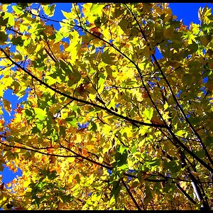
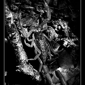
One of the things i learned about recently was colour photos that could be turned into black and white images. The thing i remember mostly, was how the main subject's tones had to be contrasting to it's background, and this images well and truly ticks that box...but the black and white doesn't do much for me in this instance.
I hope i'm making sense, i'd like to get involved here rather than sit on the fence, apologies if anyone's offended.
Hello Big_Stu, I read your comment now, it makes sense to me.
I didn't go to a photography class, so I'm as puzzled as you on B&W. But in this case, hehe, I think I'd simply try reshooting if I get another chance.
I opened this link (again - I had seen it when it was new) with my daughter sitting in the background and she IMMEDIATELY said: "The colour one is nicer!"
That is what I had thought about this even when I first saw this thread.
And I still share her (and many other members`) view. The b+w leaves me puzzling out what I see (which sometimes isn't too bad when a photo makes you look longer and THINK a bit, but here I was just confused), while the colour version is instantly appealing.
A) by the nice colour contrasts (grey asphalt, very colourful leaf) and
b) by the fact that the surface tension of the water shows so much clearer. I really like that aspect too.
One possible reason why it doesn't do well in #1, I think, is because it's a caught-in-the-middle case. It's too much to see clearly what it is, on the other hand, it's not abstract enough to go the other way.


")