What I think is that posting 10 pics in one thread and hoping for informative comments is about 7 photos too many.
Second immediate thought after no more than a glance is that most seem to be underexposed, save a few, and that again I feel strongly that I myself don't like vignetting. One's not sharp, don't know if it's the state of zoom (got into "digital zoom"?) or if after having zoomed out so much the camera needed so much light that you could not longer handhold your photo (gnarled tree 2). That's all I'm thinking about these just now.
As people said, there are too many pictures to leave comments on all of them. I'll just comment on the last 3.
8 & 9: the main subject of these pictures is obviously the dead tree in the foreground but you chose to exclude the base of the trunk. Why? I think these pictures would be better if they showed the complete tree, maybe in a portrait orientation. Also, the blown out sky is not very pleasing; but I guess it was difficult to avoid given the dull weather.
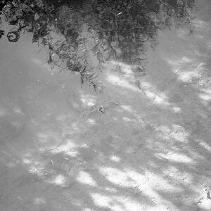
10: underexposed: the snow looks grey. Also the darker edges don't anything to the shot IMO.
I really like #2.
#3 isn't bad, something about the contrast I like.
I think #5 & #6 are beautiful. They are a bit dark, but it gives the sense to me of coldness.
The last one is very underexposed, and while I like the concept of the dead tree, its too bad the entire trunk isn't visible.
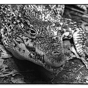
#1, not very interseting
#4,seems kind of cluttered, no main point of interest.
And #7 white balance looks off.
#3 has potential, I like the contrast.
#10 also has potential IF it was brightened up a LOT, cropped and the vignette was gone. The curves and lines have appeal.
When shooting in snow try using an exposure comp of +1, check your histogram to make sure it is right and adjust the exposure comp up or down from there.
I recommend the book Understanding Exposure. It walks you through situations like this. Should be available from a library.
I know that some of my pics are underexposed, but I didn't do it by mistake. I was trying to get across the point of a gloomy winter day, so I left my pics a little dark, as in pics 5, 6, and 7.
With pic 10, I also wasn't trying to create a bright snow covered hillside that would look great on a Christmas card. I took it in black and white and left it darker to try and convey a feeling of emptiness.
As for pics 8 and 9, I just saw an old tree and snapped a couple of B&W shots of it. I didn't include the trunk or ground of it, as that is what you see in every other boring tree picture.
All in all, most of my pics taken on this day sucked because of the overcast, so I played around with some different editing techniques and wanted to see what people thought. The general consensus is that they suck, and I agree. The only ones I like out of the bunch are numbers 2 and 3.


![[No title]](/data/xfmg/thumbnail/34/34132-7c7fbdcb2006703d33f975289561cd9d.jpg?1619736303)
![[No title]](/data/xfmg/thumbnail/34/34131-26fa915af5e4adb9d0f123c4c8b7cae4.jpg?1619736302)