convert 2 to black and white. number one doesnt have enough DOF. but if you want it that shallow, focus on the front or back of the lines, not in the middle.
Thanks for your suggestions. I agree about the grass shot, it doesn't have a point of interest.
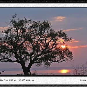
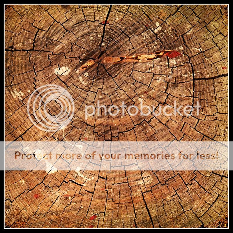
Here's the b&w conversion. Not sure if I like it better than the color though...
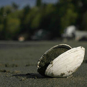
Personally, I like #2 in color. It catches my eye and I look deeper into the wood grain and color. I also like how you placed the core of the wood off-center.
Number two is cool and I've done several of those type of shots (and still do) when I experiment with depth of field. Learning by doing!


") !
!