The Artist: Help and C&C

kanuski

No longer a newbie, moving up!
Joined
Sep 23, 2012
Messages
212
Reaction score
35
Location
Saskatchewan, Canada
Website
www.flickr.com
Can others edit my Photos
Photos OK to edit
I was getting photos of some kids on their own turf. This boy had his own little art studio. He did some really nice painting so the chalk drawing was just messing around. The problem I had here was that the room was very small. It was about 5 feet wide and there was about three feet of space behind him. I was standing in the hallway to get this picture. I put a bare flash on a shelf behind him and bounced it off the wall. This shot was a little too bright but the expression and pose were the best of the bunch.
I may get a chance to try this again in the next few weeks. Any suggestions?
 

Attachments

  • $artist.jpg
    $artist.jpg
    122.2 KB · Views: 154
Not really a fan of the cut-off ear.
 
Not too bad, really. One thought might be to have the boy right up against the chalkboard, actually with the back shoulder touching it. I'm seeing that technique used more and more by skilled shooters using OCF. The close proximity to the background visually "grounds" the subject by virtue of a real shadow, cast by the light...it's a different effect than what you have here, and with that drawing, I would consider having the boy turned to opposite way, and placed more off to the right, so that the shadow would not obscure the drawing.

I dunno..this looks good...it's always a tossup between lighting the subject "bright" and letting the background go "dark", as was done here....maybe dragging the shutter more, to pick up background light? Maybe go ultra-wide lens?

This might have been better with a horizontal camera angle, to get the wider-angle look; something about having the right side of that chalk man cut off bugs me...
 
Thanks Derrel. Here is one you might like better. I didn't like the expression as much but I did shoot it wider. This was cropped from a portrait orientation.
$270A3337.jpg
 
Reading your post and the tight area you had to work in, I think you did all right. Derrel's suggestions are spot-on and you might get the chance to put them in play, just to see what you'd get. But the cropped off ear isn't bothering me at all, and I doubt it would bother the boy's parents - his expression is terrific, and the artwork is there only as a suggestion, so the DOF works and the crop doesn't matter as much on that side. The bounced flash worked well, no harsh shadows, etc.

You mentioned he had done a really nice painting - if you took a picture of him with his more "serious work", you'd want to take care that your composition paid it due respect. ;) But this shot is playful and for what it is, I think you did a good job.
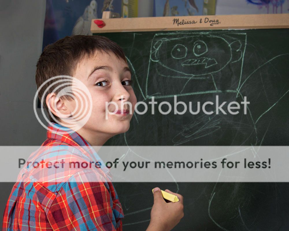
 
I came back to this thread after thinking about it last night. Normally, I often rage about weird crops, but the thing about the first image is that the cropped off ear doesn't even bother me. Why not? well, the boy's eyes and the drawing character's eyes, and the chalk that created those very eyes, all form a triangular grouping of points of interest. The chalk, held in the boy's hands...the drawing and its eyes...the boy's eyes and smile...the CATCHLIGHTS the flash caused in the boy's eyes...the bright chalk catchlights the boy dotted onto the drawing's eyes...the cropped off ear doesn't even enter into the picture. I wish the drawing figure were more-complete,yes-- but still, it's got enough there that we easily get the picture.

There has to be a defining line on any tight, close cropped image...the worst one is the CHIN...the top of the head is acceptable most of the time, but the chin is almost never, ever cropped off...although the first frame is a bit unorthodox, I think it actually works pretty well, even with that defining edge being his ear. His expression is good too, as is the way he is holding the chalk, and the way his arm and the chalk overlays the figure he has created, which creates a good feeling of depth. The tight, dramatic cropping and good expression of the first frame outweigh the wider crop of the second shot. I vastly prefer the first picturee, despite its unusual design.
 
Thanks Terri,
The ear does not bug me at all either but I am going to try to shoot a little wider and crop in post from now on.
 
I'm a big believer in the impact of luminosity in different parts of a picture on the viewer to help him understand the shot and what is important.
So I darkened the blue wall and then used a curves layer to darken the entire back background. (and burnt the lower right corner.)
Brightened the boy and warmed him up a bit.
Then sharpened the boy only with unsharp mask.
By handling the background different than the foreground, it makes the important things just pop out at you, I think.

270A3337LLLLL.jpg~original
 

Most reactions

New Topics

Back
Top