The Cabinet Maker's Wife

Dick Sanders

TPF Noob!
Joined
Sep 7, 2008
Messages
222
Reaction score
2
Location
Southern California Desert
Website
www.dicksanders.com
Can others edit my Photos
Photos NOT OK to edit
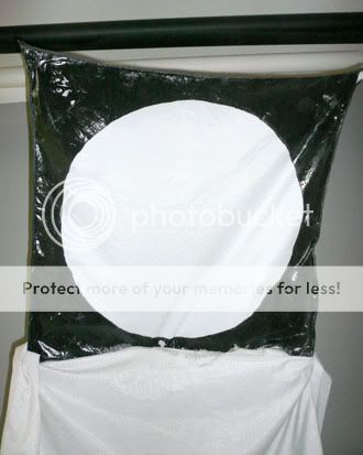
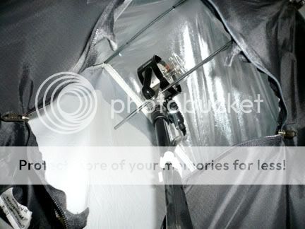
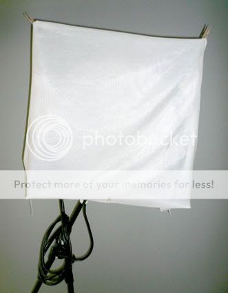
Usually I'm commenting and helping here, but I thought I'd post one for comments. My cabinet maker came over to install some custom shelving and brought his wife. She was very quiet and shy and had the darkest eyes. I asked if I could make a portrait of her while her husband installed the shelves. Key light is a 36 inch softbox directly in front and above the subject; second light on the white background; white reflecting flats on each side.


LILI-6x7forforuma.jpg


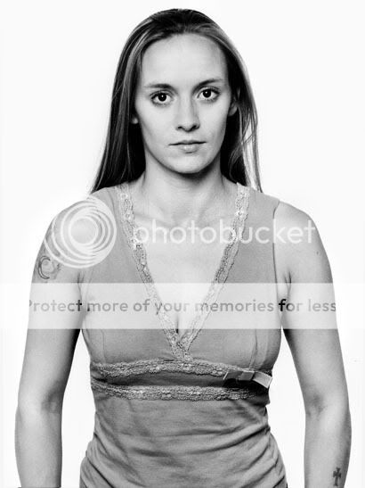
Comments welcome. Oh, and she does have a name -- Lili.
 
Last edited:
It looks very severe. I'm not sure if that's what you were intending but she looks very "hard" if you will. The look pairs well with the eyes. I think with different lighting it would have been very haunting.
 
and that comes through in the photo, so to me, mission accomplished, and good work.
 
she looks uncomfortabel to me....something just out of place about the arms
 
she looks uncomfortabel to me....something just out of place about the arms

The arms, to me, gave me two immediate thoughts: "She's holding her arms out like 'don't mess with me'" followed by "maybe she has her hands in her pockets"

I like it. The straight-on shot captures her well. I would have liked a darker background, but really that's all I have to add :)
:thumbup:
 
I was thinking the same things as AMY she does looks like she could kick my ass. I would really like to see a softer pose and lighting with a dark background. It is a beautiful shot and she is a beautiful model though.
 
Lili is a tough young woman and her thumbs are stuck in her jeans pockets (it adds tension). She's also a pretty young woman, and it's probably not pleasant to think of her having a hard life. There's a tendency to want to make her softer, lovelier. But my work is primarily serious portraiture of strangers (I often do street portraits in rough neighborhoods). For me, it's all about what's revealed about life on the face. And how much time (or life lived) I can show on the face. When I met Lili she was, essentially, a stranger to me, and the above portrait was made within minutes.

Also, while I use both light and dark backgrounds, the dark background tends to be more mysterious, more romantic, more glamorous. The white background is emptying -- it forces you to examine and contemplate in a non-romantic way. But often, when I get to know a person, I'll also do a romantic (or happier) portrait of them because, typically, he or she doesn't like the portrait I made for myself. So, let me show you the romanticized portrait of Lili that I made two years later. It's still very serious, as I prefer that, but Lili herself is very serious. It's also revealing, I think. And Lili liked this one.

Liliforforum2c.jpg
 
Last edited:
I think the stark contrast and gritty realism is spot-on. This is further up-held by viewing the same subject shot in a different setup. The harsh focus of this woman’s life is exposed by viewing her troubled past in her eyes.

Furthermore, the arms are exactly where they should be. It has been mentioned above; the “don’t mess with me” point of opinion about the arm placement. But has not been mentioned, was the general trust the subject has with the photographer.

If there was no trust, her arms would be crossed or her hands would be on her hip.

The only thing I’d like to see different is the tonal contrast. She is gritty in this photograph, so darker blacks leaving the highlights alone.

Remember, this woman just came along with her husband. No intention of having herself photographed. This is as real as it gets. I truly believe this is Dick’s philosophy with these types of photographs. It is an almost impossible look to achieve via model.

Great job as usual Dick.

-Nick
 
Dick,
great photograph, both of them.
Two different intentions for two distinctly different audiences, both given exactly what they wanted and what they needed.

Certainly the use of Notan mode of lighting rather than the usual Chiaroscuro portrait lighting for the first photograph is the root of the "hard", and "rough, kick-ass" comments. You carry on the great Richard Avedon work from the "In The American West" portraits. Reality, you go to the subject, to where the subject is comfortable and you make the photograph. Very consistent images in light, tone and attitude. You allow the subject to reign supreme, not the photographer. This is not easy.

The second portrait is for the sitter. A nice likeness for her mother. Different intent, different audience.
 
Nick and Fridrich: Thanks for your comments. Nick, I'm going to show a version with a little more contrast and darker blacks. Which will also push it more toward the "Notan" mode of lighting/design Fridrich mentioned.

--From Wikipedia:
Nōtan (濃淡, Nōtan?) is a Japanese design concept involving the play and placement of light and dark next to the other in art and imagery. This use of light and dark translates shape and form into flat shapes on a two-dimensional surface. Nōtan is traditionally presented in paint, ink, or cut paper, but it is relevant to a host of modern day image-making techniques, such as lithography in printmaking, and rotoscoping in animation.

LILI-6x7forforumnotan.jpg
 
Nick and Fridrich: Thanks for your comments. Nick, I'm going to show a version with a little more contrast and darker blacks. Which will also push it more toward the "Notan" mode of lighting/design Fridrich mentioned.


LILI-6x7forforumnotan.jpg

I get you, but I think there is two things to do in getting that look. First is make-up to lighten the skin. Second, and most importantly, is to get high contrast from to lights 45 degrees to the subject's center. One left and one right.

I am thinking more of a silver umbrella rather than a soft box.

That might just give this a starker contrast.

Just some thoughts. I liked the photograph the way it is. Changing it as you did in pp emphasizes noise and discoloration of her skin. Now if you were to drop the red channel more...

-Nick
 
Hey, Nick, thanks. I appreciate your comments, which should also be valuable to others. I worked out this lighting some time ago to give me a certain look I like. But the presentation here is compromised. First, I used Photobucket -- I'm taking your advice and switching to Flickr. Second, this is an older scan from a darkroom print (not a good scan from the neg), so the quality is degraded.

Other than that, I can't use makeup for this kind of photography as I'm philosophically opposed to that for my "portraits of strangers" work. And also I've never liked "double catchlights" so I wouldn't use two lights in that fashion, but others take note of these tips.

By the way, I did use an umbrella style silver softbox (Westcott Apollo Mono). The light bounces off a silver reflector, before punching through the front diffusion fabric. Here's the front of the square softbox, but note I've used black fabric paint to create a circle for round catchlights (my preference).

SoftBoxRoundCatchlights.jpg


Next, here's the inside of the softbox. White fabric at left is translucent front of box. Back and sides are reflective silver. Note the head without any reflector is aimed toward the rear. The light bounces off the back and sides before punching through the diffusion fabric on the front.

SoftboxInside.jpg


Finally, the last pic shows the softbox with on additional layer of diffusion material clipped to the front (for one bounce and two diffusion). This creates a very pleasing soft light, but I didn't use it for the photo in discussion here.

SoftboxwithDiffusion.jpg


Thanks for all your comments and help. -- Dick
 
I like what I see Dick. Also, I forgot about your "stranger" shots, so I get the lack of make-up. In retrospect, this was bad advice on my part.

However, if only using the one light as you did, I might have gone with a different quality of light. For those of you who are not familiar with this term, I will define. The quality of light refers to its harshness and is determined by its source.

In this case the light was reflected using silver, but then diffused. I think the deeper contrast would have been better. This, of course, done by removing the diffuser. Either way, thanks to Dick for taking the time to show some behind the scenes stuff!

-Nick
 

Most reactions

New Topics

Back
Top