" THE CORNER' of THE CORNER DINER "

Joined
May 13, 2007
Messages
453
Reaction score
0
Location
Vermont
Can others edit my Photos
Photos NOT OK to edit
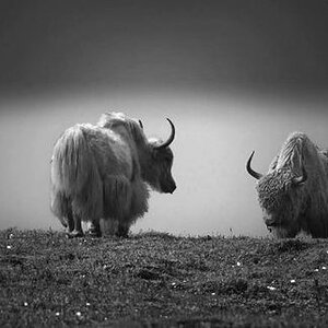
Hello All.... This one could be tuff, POV is one of those luv it / hate it relationship shots...

So lets here the points on this... I kind of feel its a little artsy, maybe even abstract....

Its Finished, so make it or break it...

  • Focal length: 9.5mm (35mm equivalent: 37mm)
  • Exposure time: 0.0097 s (1/103)
  • Aperture: f/4.0
  • ISO equiv.: 50
  • Whitebalance: Auto
  • Metering Mode: matrix


thediner.jpg
 
I like the concept, but it almost feels like a generic shot. I guess what I'm wondering what the character of this diner is? Try a few more shots of the place and then move in for shots of the chrome, maybe some flowers. If there any signs or ads out front get shots of those too.

As a side note, what's the widest lens you've got? Try this shot again but with a wider lens. The distortion might help the concept get through better. You could also try something like a holga lens.
 
Not sure I'm appropriate for a thorough critique, but the top and bottom of the corners being cut off bothers me a bit. There are some strong lines there that are leading me out of the picture.
 
Not sure I'm appropriate for a thorough critique, but the top and bottom of the corners being cut off bothers me a bit. There are some strong lines there that are leading me out of the picture.

There is plenty of substance to your post, I'm sure New England Moments appreciates your feedback on the shot.

For me, the point of view and framing on this one take what I would consider to have been a very dull shot and turn it into something very interesting. I always enjoy taking a very every day scene and showing it in a way other than what my eye would see it as. This one did that and immediately grabbed my interest, mostly based on the angles and the framing you chose.

I can definitely see where some would love it and others would hate it. :D
 
Well, personally I feel that this composition is too tight on the corner of the diner and that the corner of the flower bed in the front and corner in the roof above the canopy ought to have been included in your frame. Now I feel that something is missing that would really qualify the "corner" of the "corner diner" as a ... yes: corner. What I don't know is whether the flower bed has one or is as rounded as the very ROUNDED corner of the Corner Diner, or as rounded as the rounded canopy around the rounded corner, and whether above the canopy there is a "real" corner in the roof?

Not that I would really really need to know it, but this photo provokes in me the urge to WANT to know it, so I feel there is something MISSING.

Aside from the very tight, almost cramped composition, I feel that your POV is very ... straightforward. Normal. Un-witty. True enough: you wouldn't find me crouching or lying on my stomach for photos that much any more these days (age comes into play here, I guess), but maybe a much lower POV would have made this photo just so much more DIFFERENT that it would stick out more?

Or yes, maybe a wider lens, like someone else suggested, but I - for one - would not immediately HAVE such a very wide/fish-eye lens!
 
Hey .... Thanks you guys , appreciate your comments... and see everyones points on this... Lafoto , I did have to read your over three times lol... lottta corners going on there lol... but thanks , I do see your points!
Kristen ??? not sure what your saying or to who ??

I was concerned with the bottom and top crop, but it seemed to grow on me .. again Thanks each of you!
 

Most reactions

Back
Top