The Gateway Arch

Nikon Fan

TPF Noob!
Joined
Nov 2, 2004
Messages
3,524
Reaction score
49
Here are a few more shots from the arch, I still have quite a few more that I'm working on as well.

IMG_3651.jpg


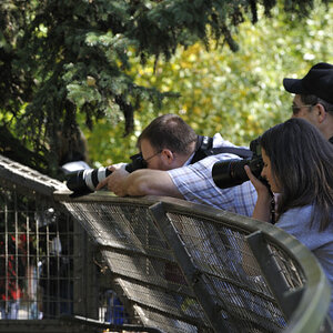
This is one of my favs...the guy just gazing at the arch is what really caught my eye.
IMG_3600.jpg


Just trying out a different effect on this, not sure how successful it is...
IMG_3610.jpg
 
Thanks Corry :) It's hard to get the whole thing in a shot...I had to walk pretty far away to do so...I've got more but didn't want to post too many shots in one day.
 
Feel free to critique if you wish...I'm always looking to improve.
 
eromallagadnama:

Your first submission appears to be a little off color. I don't remember the concrete being that reddish. If available, you might walk back a tad bit and include less sky or make use of a wide angle lens to accomplish the same task.

The next time you're at the arch; walk underneath it; point the lens skyward and see what you can come up with. If you have a wide angle lens, it will make for a more interesting shot from this position.

All said and done, it is a nice composition, but why don't you try the same or similar shot early in the morning or at dusk. I think it would be more interesting.

The photograph of the man looking upward at the arch is quite interesting, but with a wide angle lens approach, he's is too far away and almost not noted.

The photograph of the lamp is rather interesting, but you might - the next time - move to the left and show some separation between the lamp post and the shadow area of the arch. Although a similar move to the right, might have proved interesting as well.

Oh by the way, where are your photographs of the garden? (Missouri Botanical Garden)

Hope this is useful.

Bill
 
Thanks for the suggestions Bill :) I will have a chance to go back in a month or so, but just for a short time to see the cardinals play. Didn't got to the gardens, not enough time.

I appreciate your comments on the compositions of each, I have numerous photos but felt each of these were the better ones. The first is saturated a bit more b/c the silvery color of the arch blended in to much with the sky. On the second I was really hoping to convey the size of the arch, the angle was quite odd to include him more would have lost the size of the arch. I completely agree with you on the third :) I wished I had taken a few steps to one side or the other to really enhance the seperation. Thanks for taking the time to comment :)

Thanks to you as well M@ko, it was a good time :)
 
#2 :thumbsup:
 

Most reactions

New Topics

Back
Top