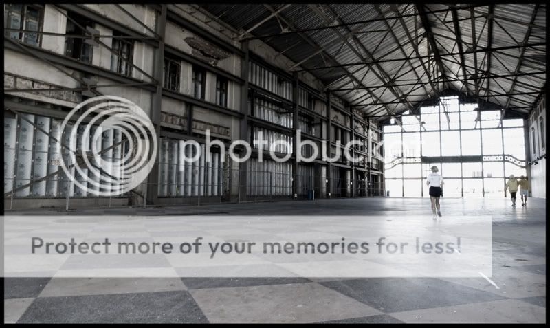
The low viewing angle and the composition are good attempts and the subdued color seems to fit the content but, IMO, neither of these pictures are effective in the long run..
There are three things that hurt the picture's impact. First, the glass wall at the end of the building is relatively large, without much interest and OOF.
Second, the wall on the right, which might have added some interest and tension to the composition picture is cut so short that the only impact it has is have is to show the keystoneing of the image.
Third, the female jogger and the other couple in shorts and running shoes remove all the mystery from the picture and keep the viewer in 'current time'.
If the figures were less average pedestrian sort of happened to be in the building then it would be helped. This is sort of like your other post, where maybe a wider lens could have brought out more of the building or possiblu just a different angle. The window seems too glary and overexposed which distracts.
I don't recommend black and white at all and I seldom shoot anything but colour. Excellent black and white requires a camera with excellent dynamic range. In digital it demands the best approach to conversion and considerable tonal work both in camera technique and in expert postprocessing with Photoshop. Contrast also needs to handled extremely well and details maintained throughout from the darkest shadows to the brightest highlights.
The subject and the environment also need to be ideal for treatment as a black and white shot. In some of the top quality work in this area, the viewer needs to look closely to see whether the shot is in black and white or colour. At the same time however some of the best black and white images would look as good or better in colour.
Too many enthusiasts and even semi-pros see black and white as an approach to rescuing a weak or poor colour shot, but that approach really does not work. A poor photo is a poor photo whether it is in black and white or colour.
1) Content - Responses should be a response to the actual posted image, should be substantive (not a simple "I love it" without any photographic reasons) and objective and should stay on topic.
It isnt necessary to be technical or use the correct terminology but any commenter should say why they have said what they did. Newcomers to photography are particularly encouraged to comment since the exercise of deciding why they like something is educational in itself.


![[No title]](/data/xfmg/thumbnail/30/30887-70db98f68651b2f6c62119e611f707c0.jpg?1619734499)