The Mentor Marsh

Digital Matt

alter ego: Analog Matt
Joined
Jan 30, 2004
Messages
5,358
Reaction score
73
Location
Santa Barbara, CA
Website
www.mattperko.com
Can others edit my Photos
Photos NOT OK to edit
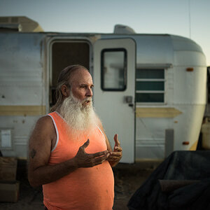
This is my first post in the critique forum. I always welcome critiques from you guys, but I thought I'd make it official :p I took this photo today just after sunset.

mentor_marsh.jpg
mentor_marsh_retouch.jpg


Let me know what you think. I converted it to b&W with the channel mixer and gave it the sepia tone. There was a curves adjustment to bring out the foreground, and another for added contrast as well.
 
Wow, great shot. I like the mood you captured and definitely using sepia tone helps with that. Adding the pond into the crop gives it a nice touch, but there's something about it that I can't quite put my finger on. Do you have a wide version of this picture?

The picture is really good as it is and I don't think I would change much if it were up to me. You could possibly add a little more contrast in the grass, but that's just being picky. Good work, D Matt.
 
Thanks Harpper :) I think I know what it is about the pond that you can't put your finger on. It's not a pond, it's the roof of my car :) I didn't want to say anything in my original post, and see if people could tell. When I took the photo, I was hoping to make it appear that way.

Thanks for your comments. I'll take a look at the curve and see if I can push it a bit further. Thanks again.
 
Too funny! I was trying to figure out why the grass was all compressed in that reflection. I like it, and the sepia is a nice touch. I'd be currious as to what more contrast in the grass would do, as Harper suggested. The moody sky is terrific. It looks to be a little big lighter in the reflection, though, which draws the eye down there. I think I'd rather have the reflection darker than the sky, so that my eye is drawn more towards the center of the image.
 
I'd like to see a larger version of this. I'm thinking it needs just a tad more detail that you can only get from just making it bigger. But not too big as your secret pond might become too obvious :p

I'd hang that on my wall.................
 
Digital Matt said:
I think I know what it is about the pond that you can't put your finger on. It's not a pond, it's the roof of my car :)
LOL. It all makes sense now. I was scratching my head trying to figure out what was wrong. I knew something was wrong. :lol: You did a good job at it though. You almost had me fooled. :wink:
 
Thanks for the comments and critiques everyone :) I see what you mean about the reflections Mark. I'll go back and fix that. It'll be no problem with a little gradient mask. I was trying so hard to get detail out of the shadows in the foreground that I overlooked the brightness of the reflections.

Here's a link to a larger version, and I'll edit the version in this post as soon as I can. Thanks everyone :)

http://www.deviantart.com/view/6827823/

Sorry for the DA link :p
 
Digital Matt...this one is awsome :)

Did you photoshoped it?

What did you done?
 
Moni said:
Digital Matt...this one is awsome :)

Did you photoshoped it?

What did you done?

Thanks Moni.

I converted it to b&W with the channel mixer and gave it the sepia tone. There was a curves adjustment to bring out the foreground, and another for added contrast as well.

I have a Canon Digital Rebel, so everything is Digital, and everything is photoshopped to some extent.
 
I edited the original post to show the retouched image and the original for comparison. Thanks for your feedback guys :)
 
VERY impressive matt! The sepia tone works excellent with this shot, and using the car roof to reflect the sky is crazy talk!
How exactly do you convert to sepia in photoshop? Im assuming it's something super easy, I just can't find it :wink:
 
pilgrim said:
VERY impressive matt! The sepia tone works excellent with this shot, and using the car roof to reflect the sky is crazy talk!
How exactly do you convert to sepia in photoshop? Im assuming it's something super easy, I just can't find it :wink:

Thanks Pilgrim. The way I get a sepia tone is to convert the image to B&W with the channel mixer, and then use a hue/sat adjustment layer. Click colorize and I usually put the hue somewhere around 40-50, and the sat from 10-30. That's it :)
 
I have to confess, PS talk makes my eyes glaze over. :wink: But this is a beautiful image, Matt. Moody and lovely. Nice work!
 

Most reactions

New Topics

Back
Top