The small creepy door

Cheesewheel

TPF Noob!
Joined
Jun 15, 2006
Messages
31
Reaction score
0
Location
Florida, USA
Website
www.cheesewheel.net
Can others edit my Photos
Photos OK to edit
Camera Model
Canon EOS DIGITAL REBEL XT
Shooting Mode
Manual Exposure
Tv( Shutter Speed )
1/500
Av( Aperture Value )
7.1
Metering Mode
Evaluative Metering
ISO Speed
100
Lens
28.0 - 70.0mm
Focal Length
28.0mm
Flash
Off
White Balance Mode
Auto
AF Mode
One-Shot AF
Parameters Settings
Contrast Mid. High
Sharpness Mid. High
Color saturation Mid. High
Color tone 0
Color Space
sRGB
Noise Reduction
Off

a2d5a899.jpg


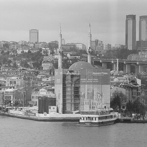
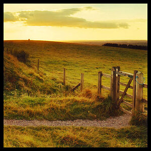
How is the composition of this shot? Is it as neat looking as I think it is?
 
well for the creepy look i would of made the print just a bit darker and i think that would bring out alot of contrast too.
 
well for the creepy look i would of made the print just a bit darker and i think that would bring out alot of contrast too.

Here is the same picture with the exposure down 3/4 stop, the contrast tweaked slightly, and run through a 100% blue filter (rather than 75/25% blue/green)

1d6cc497.jpg


Getting closer?
 
High contrast is achieved by orange and red filters. Blue and green filters are typically used to darken skin tones in portraiture.
 
looks like a selenium print gone terribly wrong. I'd stick to grayscale.
 
Thanks PNA, that certainly looks creepier :)

I think I can tell the result of your lens correction, however I'm not exactly sure how you went about it. Could you give me some details on that process?
 
Thanks PNA, that certainly looks creepier :)

I think I can tell the result of your lens correction, however I'm not exactly sure how you went about it. Could you give me some details on that process?

Sure....in PS under filter>distort>lens correction.....Play around with the slides and have fun.:)
 
Grayscale does do it more justice. I like the darker one better the white was a little stark
 
Composition is quite centred, and there is a slight "movement" towards the right given by the long shadows of the the door handle, and I would work with that and give that part some more room (by cropping away some on the left). Need not be much but would move the door just that interesting tad off centre and give more prominence to the neat shadows. PNA is happily ignoring those shadows (;)) ... which I would never do ... but I feel your edit is the better choice, the very white pic is too little contrasted. Those neat shadows given by the low side light are just too interesting a part of your photo to go all unnoticed.
 
Composition is quite centred, and there is a slight "movement" towards the right given by the long shadows of the the door handle, and I would work with that and give that part some more room (by cropping away some on the left). Need not be much but would move the door just that interesting tad off centre and give more prominence to the neat shadows. PNA is happily ignoring those shadows (;)) ... which I would never do ... but I feel your edit is the better choice, the very white pic is too little contrasted. Those neat shadows given by the low side light are just too interesting a part of your photo to go all unnoticed.

ad911907.jpg


Is that what you had in mind?
 
Oh cool. Yes. This is it.
I know you say your pics are free to edit, but I prefer to not too deliberately make use of that offer and rather phrase my thoughts and have the photo author bring about the suggested change or not.
 
love the edit rm did. i agree you need to use more red/orange not blue/green
 

Most reactions

Back
Top