I
Iron Flatline
Guest
Hello friends.
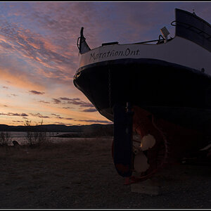
I've got what I think could be a good shot, but I need your help. I feel like this is not perfect, I'm particularly unhappy about the fat white vertical pylon that is in the center of the image. Compositionally it divides the image.
I thought this quasi-Dragan low-sat version complements the mood I'm going for, but I was wondering how some of you might have processed this.
Here is my version - the way I processed it - as well as a JPG straight off the RAW data.

The straight RAW -> JPG:

I am including:
The RAW File - quite large (12 MB)
The PSD File - warning it is HUGE (85 MB)
As always, you're welcome (and encouraged) to work with this file and edit it as you want to. Please share your technique with me and other readers of this thread.
Kind regards,
The Iron Flatline
I've got what I think could be a good shot, but I need your help. I feel like this is not perfect, I'm particularly unhappy about the fat white vertical pylon that is in the center of the image. Compositionally it divides the image.
I thought this quasi-Dragan low-sat version complements the mood I'm going for, but I was wondering how some of you might have processed this.
Here is my version - the way I processed it - as well as a JPG straight off the RAW data.
The straight RAW -> JPG:
I am including:
The RAW File - quite large (12 MB)
The PSD File - warning it is HUGE (85 MB)
As always, you're welcome (and encouraged) to work with this file and edit it as you want to. Please share your technique with me and other readers of this thread.
Kind regards,
The Iron Flatline
![[No title]](/data/xfmg/thumbnail/35/35968-01893eeb6a205c00827118fe5bb79703.jpg?1619737286)
![[No title]](/data/xfmg/thumbnail/30/30991-43abf4dfee0a54010692c71c43f40981.jpg?1619734555)
![[No title]](/data/xfmg/thumbnail/37/37523-291af5748bb3a98408cc748fb81bb365.jpg?1619738129)
![[No title]](/data/xfmg/thumbnail/30/30993-7c6dca4375064e92f2ea6cbfabf9b59e.jpg?1619734556)
![[No title]](/data/xfmg/thumbnail/35/35964-c65699557292548e7f4d384b3ca48534.jpg?1619737280)