Thinking about getting these framed. C+C please

TylerF

TPF Noob!
Joined
Oct 31, 2009
Messages
883
Reaction score
13
Location
Buffalo NY
Can others edit my Photos
Photos NOT OK to edit
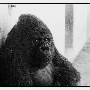
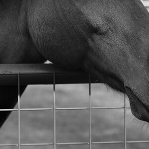
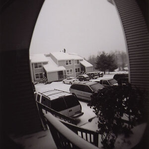
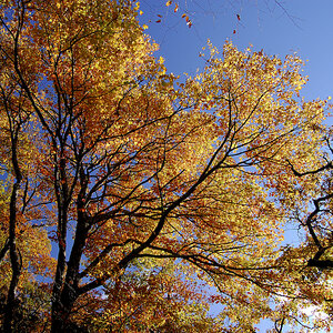
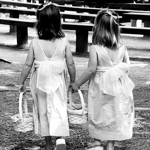
I kind of liked how these 3 look together and am thinking about framing them and putting them on a wall next to each other. what do you all think? any opinions on what order would look better?

1
2pqkgwg.jpg


2
10e0evd.jpg


3
v7sghx.jpg
 
... please tell me I'm not the only one that sees "mommy parts" in #1
 
i didn't see it until you brought it up lol.

these are all different trees btw lol
 
for some reason lately it seems like nobody cares to respond to my threads lol
 
for some reason lately it seems like nobody cares to respond to my threads lol

Don't be disheartened. It happens. Sometimes it's simply nobody has anything to offer beyond, "Good shot."

I'm not bonding with these photographs. Initially, all I see is a lot of vertical lines. The contrast if pretty strong too.

What size did you print? That might have a bearing on the impact.

-Pete
 
i havent printed them yet, but i am drawn to patterns and stuff in vines and trees for some odd reason haha. i did make them contrasty on purpose but maybe i went too far?
 
I see intimate details of a woman in #1, too! Haha. I thought that yesterday with your other post.

Obviously they'd look OK hanging next to each other since they're all the same theme, but I also see a lot of vertical lines. If you decide to hang them, I'd put #1 in the middle since it's the least like the others. JMO. I'm no expert, obviously, but that's how I would do it if I hung them in my house.

Looking at #1 again...ummm...mommy needs a waxing! Ewwwww! OK, did I go to far? LOL...


ETA: I like the contrast. Gives "pop" to something that otherwise can be considered dull.
 
haha you guys gotta get your minds out of the gutters! lol i usually am the one who notices things like that. heres one i was gonna put in place of the third one but wasnt sure. i was planning on #1 in the middle as well thanks for the comments

mszkg3.jpg
 
haha you guys gotta get your minds out of the gutters!

I've got a 9 month old at home.... At this point in the game, EVERYTHING looks like "mommy parts" :gah:
 
Tyler
When asking opinions about which ones someone likes, it is difficult, as we all have different opinions about what we like/see.

I like #2 only...I also would not mind seeing some of the contrast toned down or just lighten the highlights or shadows as well.


P.S.
My brother lives up in Green County, NY. Is that far from you?
 
number 2 is a keeper, just brighten the shadows maybe... and i def. wouldnt print number 1 lol cause of the mommy parts thing lol
 
lol i dont mind the fact that it reminds some people of "mommy parts" thats my favorite thing about art/photography, it means something different to everyone. i think im just going to print them and see how they look on a wall. it's for myself, so i guess if i like tham, that's all that matters haha. I was just wondering what people thought. I for some reason like the high contrast of them. usually i dont do it as extreme.

and i have no idea where green county lol
 

Most reactions

Back
Top