This any better? (Inspired by New England Moments)

butterflygirl

TPF Noob!
Joined
Feb 21, 2007
Messages
401
Reaction score
0
Location
Michigan
Website
www.photosbymcdonald.com
Can others edit my Photos
Photos OK to edit
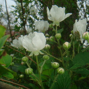
Last week I submitted a few flower shots and most didn't like the lighting :( so I tried taking New England Moment's advice, using natural light with a colored paper background - is this any better? C & C?

rose-1.jpg


It's all I've had the chance to shoot so far, but hopefully more flowers will bloom soon and I'll be able to experiment with more.

Thanks for looking!
 
Hey yes!
By all means!
A) this was a really good piece of advice by NEM, and b) the light is 100% better. I really like this one!
 
This is great, actually i remember the last ones and liked them very much if not more. perhaps it really is just a matter of taste, but i usually like something where the author has dared to be different just because they are different. Which ever way you go keep up the good work.

tim
 
This is great, actually i remember the last ones and liked them very much if not more. perhaps it really is just a matter of taste, but i usually like something where the author has dared to be different just because they are different. Which ever way you go keep up the good work.

tim

Thank you very much TPE! Much appreciated! :wink:
 
The background is competing, (and winning) with the subject. You should try to use a contrasting color in the background, or a netural, and perhaps light it a bit more subdued. The flower has subtle magenta hues in it, and the background is a yellowish/red. The two don't mix well. I would personally use a black background paper, and keep it pretty far from the flower.
 
The background is competing, (and winning) with the subject. You should try to use a contrasting color in the background, or a netural, and perhaps light it a bit more subdued. The flower has subtle magenta hues in it, and the background is a yellowish/red. The two don't mix well. I would personally use a black background paper, and keep it pretty far from the flower.

I did use two other backgrounds - blue and green - this any better?

1.

IMG_1287.jpg


2.

IMG_1284.jpg
 
Yes, those are much better. See how the flower pops off the background in these? I would still move the background further from the flower, or use less depth of field next time.
 
Id like to put a vote in for the green background. Not only does it make the flower "pop" more, as Matt said, its a more natural color. Beautiful picture.
 
Yep I like the green one most. You should fix the shadow in the top right of it though. (although it's small)

Nice shots.
 

Most reactions

New Topics

Back
Top