
sergio_aguero
TPF Noob!
- Joined
- Feb 24, 2012
- Messages
- 2
- Reaction score
- 0
- Location
- Caracas, Venezuela
- Can others edit my Photos
- Photos NOT OK to edit
This is some of my latest work, i've seen how u guys C&C some of this photographers work and i think that is useful for future projects, my complete gallery is on my flickr: Flickr: sergio_aguero's Photostream

Drop Dead Gorgeoushttp://www.flickr.com/photos/sergio189/6895108443/sizes/z/in/photostream/ on Flickr
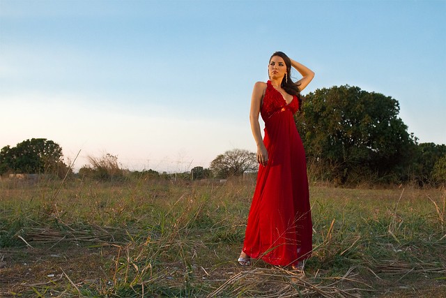
The Girl In Red II on Flickr

The Girl With The Hat on Flickr
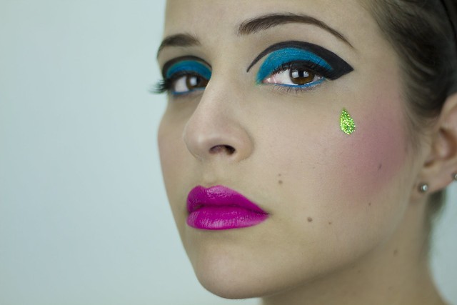
Color Block I on Flickr

Rock N Roll Babe II on Flickr

The Girl In Red I on Flickr
Drop Dead Gorgeoushttp://www.flickr.com/photos/sergio189/6895108443/sizes/z/in/photostream/ on Flickr
The Girl In Red II on Flickr
The Girl With The Hat on Flickr
Color Block I on Flickr
Rock N Roll Babe II on Flickr
The Girl In Red I on Flickr
")
 Ooooh... we've not had a 'mistakes are art' thread in a long time!
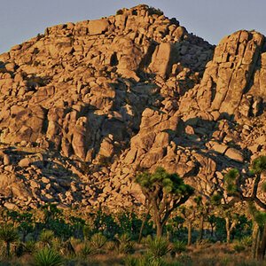
![[No title]](/data/xfmg/thumbnail/31/31038-84f0b9d14b7ced20e61bc19a9d4dfcc2.jpg?1619734581)
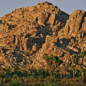


![[No title]](/data/xfmg/thumbnail/31/31039-558cdb3d311dc67b7a2134527e230488.jpg?1619734582)
