This makes my fifth time shooting a "model" C&C welcomed as always. (nine images)

UnknownBro

TPF Noob!
Joined
Apr 15, 2013
Messages
186
Reaction score
50
Location
Las Vegas, NV
Can others edit my Photos
Photos OK to edit
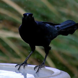
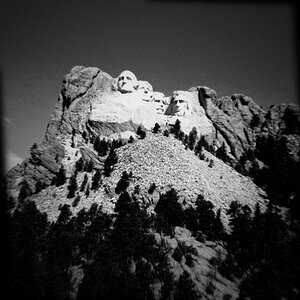
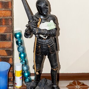
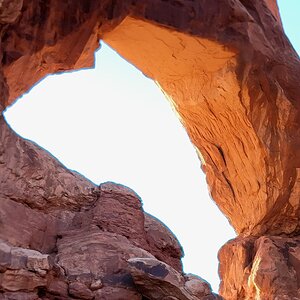
I counted up my shoots today, and this is my 5th shoot. Hope I'm getting better, and thanks for all the input you guys have given me. I hope I've put it to good use.

1.
JJ1bNDL.jpg

2.
y7k8S0N.jpg

3.
FnmLine.jpg

4.
DDhuItn.jpg

5.
FXSfJVQ.jpg

6.
hA5Xk0B.jpg

7. Not really happy with how it's composed, but I like the background.
NofYaOx.jpg

8.
QoiVWWW.jpg

9.
lb2ZQyj.jpg
 
One thing that I'm noticing, is that she takes up such a small percentage of the frame. The first one maybe 20% and the rest are much less.
That's not necessarily a bad thing per say, but it makes it hard to judge what the real subject of the photo is supposed to be. Is it the model? is it the scene that she's in? Is it her clothing?
Quite often, a strong photo is one that has a strong, clear subject for the viewer to see. They say a picture is worth 1000 words, and I believe that those words should be a good/interesting story. I'm not really saying that these photos don't tell a story...but just that I think the story could use some editing...so to speak. Maybe a better way of saying it, is that I think they could be more interesting than just a pretty girl standing there.

Also, her posing is lackluster. In most, she has her shoulders pretty much square to the camera. That isn't the most flattering pose, especially for females. She is bending her legs in most, which is good but I think that better posing and maybe interaction with her surroundings could make things better.

As an example, the one where she's behind the rail is great because she isn't square to the camera and with both her hands on the rail, they aren't hanging or shown as level in the photo. The rail itself is a good 'leading line' and it helps that she's interacting with it. Take that idea and make the light a little more dramatic and get closer (zoom in) and I think you'd have a much stronger image.
 
Of the set the last one offered the most potential as a setting... but you didn't really make the most of it.

your composition has her in front of the background elements and conflicting with them. i'd have wanted her farther to the right, and probably composed landscape, and probably composed tighter.
 
Awesome input guys thanks. Thanks for that insight. Maybe it's because I started shooting landscapes. I'll make a point to compose tighter.
 

Most reactions

New Topics

Back
Top