Navigation
Install the app
How to install the app on iOS
Follow along with the video below to see how to install our site as a web app on your home screen.

Note: This feature currently requires accessing the site using the built-in Safari browser.
More options
You are using an out of date browser. It may not display this or other websites correctly.
You should upgrade or use an alternative browser.
You should upgrade or use an alternative browser.
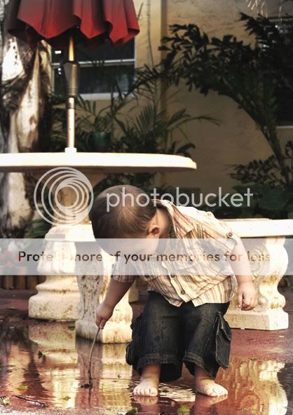
this one I am proud of
- Thread starter JustAMom
- Start date
RMThompson
the TPF moderators rock my world!
- Joined
- Nov 12, 2006
- Messages
- 1,888
- Reaction score
- 11
- Can others edit my Photos
- Photos NOT OK to edit
Good picture, but the editing to the color is too obvious in the upper left corner.
tahmail
TPF Noob!
- Joined
- Jan 14, 2007
- Messages
- 106
- Reaction score
- 0
- Location
- Colorado Springs, CO
- Can others edit my Photos
- Photos NOT OK to edit
Maybe crop this and "zoom in" a bit on the subject so there isn't as much background to distract.


dewey
TPF Noob!
- Joined
- Sep 14, 2006
- Messages
- 650
- Reaction score
- 29
- Location
- The Space Coast of Florida
- Can others edit my Photos
- Photos NOT OK to edit
I might crop and straighten it a bit... good capture!
I also agree with the color in the top left - it's a bit distracting. The background is also too busy for me. My eyes are fighting to go between the child and the bench.
I also agree with the color in the top left - it's a bit distracting. The background is also too busy for me. My eyes are fighting to go between the child and the bench.
Peacemaker636
TPF Noob!
- Joined
- Jan 7, 2007
- Messages
- 156
- Reaction score
- 0
- Location
- Iowa, U.S.
- Can others edit my Photos
- Photos OK to edit
I like the subject a lot, very nice job on that. The background is pretty busy though and is fairly distracting. In the future, this can be avoided by possibly getting a lens with more DOF, but of course that's not always an option (either because of expense, or not enough time to switch lenses), so you can always change your line of sight so there's less in the background.
Of course, when there's sentimental value in a photo, it's better to have a picture that isn't perfect than to not have one at all.
Of course, when there's sentimental value in a photo, it's better to have a picture that isn't perfect than to not have one at all.
gmarquez
TPF Noob!
- Joined
- Mar 24, 2007
- Messages
- 486
- Reaction score
- 1
- Location
- Arroyo Grande, CA
- Can others edit my Photos
- Photos OK to edit
From an artistic sense, I agree, in future pictures where you can't avoid a busy background, have the background be out of focus (shallow depth-of-field) in a pleasant way (bokeh?)
I like the "pose" and the reflection...however, even with candid shots, I am always aware of the background, and you can often see me circling my subjects (family members) trying to capture a good moment with a nice background as well.
I like the "pose" and the reflection...however, even with candid shots, I am always aware of the background, and you can often see me circling my subjects (family members) trying to capture a good moment with a nice background as well.
hazzayoungn
TPF Noob!
- Joined
- Dec 20, 2006
- Messages
- 110
- Reaction score
- 0
- Location
- Seattle
- Can others edit my Photos
- Photos OK to edit
i think hes very cute
i added curves, brightness contrast, and saturation hue, and a slight vignette, as well as slight rotation and crop to get rid of the empty space. i think it might be a little dark though
i added curves, brightness contrast, and saturation hue, and a slight vignette, as well as slight rotation and crop to get rid of the empty space. i think it might be a little dark though

Thor06
TPF Noob!
- Joined
- Mar 20, 2007
- Messages
- 64
- Reaction score
- 0
- Can others edit my Photos
- Photos NOT OK to edit
Wow, I think that is an excellent picture. I like the original pic, but I second the more DOF comment, it does get a bit distracting. Just imagine what he'll say when he gets older and you show it to him!
- Joined
- Dec 11, 2006
- Messages
- 18,743
- Reaction score
- 8,047
- Location
- Mid-Atlantic US
- Website
- www.lewlortonphoto.com
- Can others edit my Photos
- Photos NOT OK to edit
IMO, the important qustion is why is the square format picture above much more successful?
Not because square is inherently better but for three reasons: 1) the obvious off-vertical pole is removed
2) the distracting excess at the top is removed
and 3) the pose is sort-of-square so the subject is framed better.
However the cropped to square makes it seem a little like the top border is pressing on his head.
Starightenting, blurring the background and 4 x5 crop makes a pleasant picture. (With a full-res image I would have selectively sharpened the figure of the little boy and done more to blur the background and the pavement behind him)
Assuming color balance and exposure have already been corrected, for any picture of mine that has an interesting content, I look at these things in order: 1) make things that should be vertical (or horizontal) correct. That eliminates distraction - unless that issue is important to keep.)
2) I try to crop to remove things that don't contribute to the image and place the object of interest in a good portion of the frame.
3) I try to correct the parts I couldn't remove in 2 by darkening or lightening or blurring as required.

Martha
TPF Noob!
- Joined
- Mar 21, 2007
- Messages
- 12
- Reaction score
- 0
- Location
- Missouri
- Can others edit my Photos
- Photos OK to edit
aww....I like all the edited options shown....I think the picture itself though is PRICELESS...Granted I do agree the background was busy...but I LOVE that he's not looking at the camera...I'm a candid lover though...I love smiling pics too but candids truely capture the moment IMO>
JustAMom
TPF Noob!
- Joined
- Mar 24, 2007
- Messages
- 206
- Reaction score
- 0
- Can others edit my Photos
- Photos NOT OK to edit
- Joined
- Feb 1, 2004
- Messages
- 34,813
- Reaction score
- 822
- Location
- Lower Saxony, Germany
- Can others edit my Photos
- Photos NOT OK to edit
It is, of course, no longer easy to really critisise a photo about which the owner states clearly that he/she is proud of it. It shows that the owner is very happy with the result, feels it is a good photo as it is, so actually is only looking for encouragement.
(Food for thought in general for pics that go posted in Photo Critique).
It is a lovely scene, indeed.
Children that young will take their steps into life and naturally will create one endearing scene in their wake after the other.
So yes, you quite undoubtedly captured a very endearing scene here.
However I find you included way too much background. Even your latest edition still shows too much. You boy's glance goes towards the floor, the puddle, the activity he is doing there. Why do we have to see the umbrella? And a red umbrelly to boot! A very distracting colour, since it is so prominent - even in the desaturated version.
Both activity and gaze are towards the bottom of your frame, why not stay with only that? Why not crop to underneath the table? Or leave just a line of the table inside the frame as maybe an element of "protection", if you want to see that there?
I don't know what you work with and what is your camera's largest aperture, and what degree of blurriness in the background it can create. But even with "my" cropping idea in mind, I still find the background a bit too clear, but not so bad once the umbrella is gone.
Just my
 ...
...
(Food for thought in general for pics that go posted in Photo Critique).
It is a lovely scene, indeed.
Children that young will take their steps into life and naturally will create one endearing scene in their wake after the other.
So yes, you quite undoubtedly captured a very endearing scene here.
However I find you included way too much background. Even your latest edition still shows too much. You boy's glance goes towards the floor, the puddle, the activity he is doing there. Why do we have to see the umbrella? And a red umbrelly to boot! A very distracting colour, since it is so prominent - even in the desaturated version.
Both activity and gaze are towards the bottom of your frame, why not stay with only that? Why not crop to underneath the table? Or leave just a line of the table inside the frame as maybe an element of "protection", if you want to see that there?
I don't know what you work with and what is your camera's largest aperture, and what degree of blurriness in the background it can create. But even with "my" cropping idea in mind, I still find the background a bit too clear, but not so bad once the umbrella is gone.
Just my

JustAMom
TPF Noob!
- Joined
- Mar 24, 2007
- Messages
- 206
- Reaction score
- 0
- Can others edit my Photos
- Photos NOT OK to edit
i guess i leave the umbrella becuse I have so many close ups of my son I want to also have some pictures that show his environment, especiially his favorite "spots" he had growing up. that is his favorite place to play outside, we are out there every day. i suppose i could just take pictures of the special spot to show him seperately, but there is something about seeing him IN his special spot that is endearing to me. if I didnt have (literally thousands) of close up pictures of my son I supposed Id crop this one in tighter.
and la photo you are right i could have titled this differenttly. i was indeed content with my original shot, however i knew after some critique I wuld be further inspired to make a few changes to get it closer to being a better picture, but without removing what meaning it has to me. it would have properly been stated, "i am proud of my starting point on this one" because I was and I still am. I have a lot to learn, but I captured a great moment, and with my son, that it 95% of the battle LOL
also, this photo (without a border or tag on it) will go in his scrapbook with journaling about his "favorite place to be"
also, i would love the background a little more blurred, but since i am not very great with post editing techniques i wasnt able to create the effect properly. aside from retaking the photo with a better DOF, which is impractical, I am at a loss for that aspect. a i improve though perhaps one day i will revisit this photo and be able to improve it even further.
and La Photo, I truly appreciate your insight and criticism, as its obvious you ae very knowledgeable about all of this. however, to be honest, i find your way of delivering you criticism to be a little hostile. if i have done anything to step on your toes in any way i truly apologize. i try not to take things personally but you seem so angry in your replys thats its hard not to... i may not know a great deal about photography but I do know a thing or two about treating people kindly...
Similar threads
- Replies
- 9
- Views
- 641
- Replies
- 15
- Views
- 1K
- Replies
- 11
- Views
- 913


![[No title]](/data/xfmg/thumbnail/40/40288-4d5d7a8aa74ddfceb5fb82062d9b21be.jpg?1619739409)
![[No title]](/data/xfmg/thumbnail/41/41493-60071420f928565170996b4edc3de2f0.jpg?1619739820)
![[No title]](/data/xfmg/thumbnail/41/41490-6af71315284539e04ae1878cda0d613f.jpg?1619739818)

![[No title]](/data/xfmg/thumbnail/36/36132-5bd4fa365c199003273e0ff128bf42f4.jpg?1619737384)
![[No title]](/data/xfmg/thumbnail/38/38262-10a9668da9a2b36a92cddde57caf87bc.jpg?1619738547)
