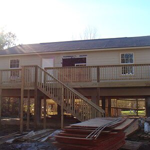
The wall seems a bit "punchy" to me, I think perhaps adjusting tone curves to make the wall pop a bit less might make this one more to my taste. This is, as they say "good seeing".
Is there any more room at the bottom of the frame? I feel like the bottom of the door could use a little breathing room. It's a minor detail at most, though.
There was too much construction debris at the bottom of the frame to clone or do anythig else with..I didn't thjink it hurt the image enough to worry over. The walls are really quirky in tonal shifts. If you go for the pop on the walls it works in some areas, and not in others makig for a odd uneveness. I did do three passes on the walls and adjusted in each tonal area for one uniform look..it bothers me as well but again not enough not to keep working the image. I like it...odd as it is.
Interesting. My inclination would be to darken the mid-tones without changing the highlights. This would make the wall less noticeable and also make the highlights in the door and windows stand out more.


![[No title]](/data/xfmg/thumbnail/35/35952-55c8d42ec1c6ff0e13b45356cbf9c068.jpg?1619737263)

![[No title]](/data/xfmg/thumbnail/40/40284-f59f6230f0d5b9eacf977f8b0392f087.jpg?1619739407)