OP
OP
Valls
No longer a newbie, moving up!
- Joined
- Jun 29, 2015
- Messages
- 106
- Reaction score
- 34
- Location
- Brazil
- Website
- www.instagram.com
- Can others edit my Photos
- Photos OK to edit
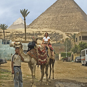
I'm actually more of a lightroom guy! hahah but I think the same applies there! I'll go back and reduce my adjustments! Thanks a lot!From the looks of it, in post. Do you do your editing in photoshop, and if so do you use adjustment layers? I personally use adjustment layers, and after I've made my adjustments I'll revisit each individual adjustment layer to reduce it's opacity; in most cases my initial changes are exaggerated, so going back and reducing each one a little bit gives me more subtle but also more effective results.You mean, overexposed on post or in camera? Here's the shot as it was captured:
In these shots, I think you could reduce whichever adjustments you made that affect the exposure and contrast.
")
![[No title]](/data/xfmg/thumbnail/39/39292-4169a355b794ae9735845c4ad45d06ff.jpg?1619738958)
![[No title]](/data/xfmg/thumbnail/31/31749-6cf0f99d6bdedf47f7387c5b943fb717.jpg?1619734989)
![[No title]](/data/xfmg/thumbnail/31/31747-2e2e2bda16938a6a1d5fd6120c558293.jpg?1619734987)
![[No title]](/data/xfmg/thumbnail/35/35947-ab35bfc67d8e12ce65dda301d3bf2b66.jpg?1619737255)

![[No title]](/data/xfmg/thumbnail/37/37604-7ad625e983f92f880eb65a264eeef5e4.jpg?1619738148)