I prefer the second, but really dislike the greenish hue. Since it's by the sea, and if you are preferring a tint, try a nice contrasty blue. I think it would look nice here.
hm.
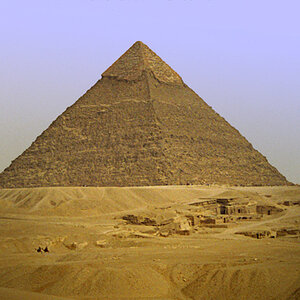
i think that the focus is not good.
(people have already told you, so i obviosly sound like some pin in the neck)
if the focus was good.
(i would also change the distance)
i think that the better one would be in colour.
because of the interesting green window-frames.
but i'm not sure.
maybe i would have another sugestion.
kiss!
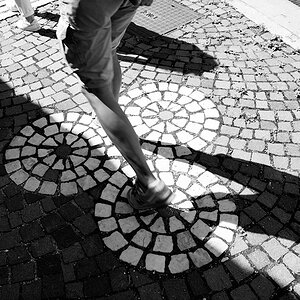
definitely the b&W cropped image. The first image is just interesting and very plain / normal feeling (for me). however the cropped B&W really changes that. It allows me to focus more on the interesting parts of the building, etc, and feels like it is portraying a historical feel. Much better in my book.
To me the B&W feels as though it strengthens the subject matter and directs the attention of the viewer better (no distracting sign colors,etc)

")

![[No title]](/data/xfmg/thumbnail/42/42057-1509913128bb1db2bc11235c05832fd4.jpg?1619739993)