Today's Wedding

roxysmom

TPF Noob!
Joined
Apr 14, 2007
Messages
78
Reaction score
0
Location
Dayton, Ohio
Can others edit my Photos
Photos OK to edit
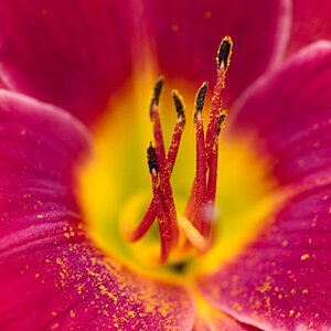
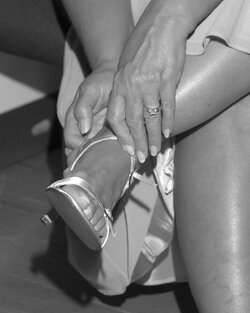
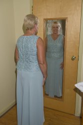
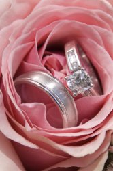
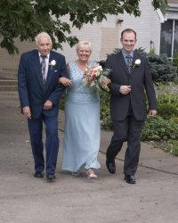
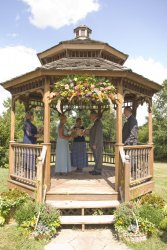
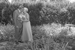
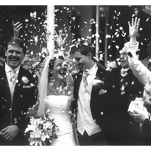
It has been a long time since I posted. This is only my 6th wedding and each time I learn something new! As you can see from the pictures it was small. I'm working on my exposure and would appreciate C&C. When I first started in this I thought I could get a good camera and work in auto and it would be good. I learned the hard way that understanding exposure and how the camera works is crucial for good wedding pictures. A piece of advice for newbies like me!!! I'd love feedback. Thank you.
 

Attachments

  • $DSC_0874 .JPG
    $DSC_0874 .JPG
    268 KB · Views: 93
  • $DSC_0888 .jpg
    $DSC_0888 .jpg
    333.9 KB · Views: 85
  • $DSC_0902.2.jpg
    $DSC_0902.2.jpg
    165.8 KB · Views: 99
  • $DSC_1000.2.jpg
    $DSC_1000.2.jpg
    154.4 KB · Views: 85
  • $DSC_1006 .jpg
    $DSC_1006 .jpg
    324.4 KB · Views: 93
  • $DSC_1030 .jpg
    $DSC_1030 .jpg
    379.6 KB · Views: 77
  • $DSC_1070.jpg
    $DSC_1070.jpg
    163.1 KB · Views: 111
  • $DSC_1095 .jpg
    $DSC_1095 .jpg
    387.7 KB · Views: 89
  • $DSC_1096 .jpg
    $DSC_1096 .jpg
    332.6 KB · Views: 109
C&C per req
1. (Mono shoe) Nice image, well focused and composed, but with an odd blue caste too it. Seems like a conversion where the blue channel may not have been completely desaturated.

2. (Mirror) Good idea, but you should have focused to get the reflection in focus rather than the back of the person.

3. (Rings) Clever idea, not seen this one done before in quite this way. The DoF seems a little shallow, and the focus on the rear of the two rings is not as sharp as it could be.

4. (Man in gazebo) Nice exposure, but the image leans to the right and is a little too centred. Also watch for compositions which have things growing out of people's heads. In this case the post and the brackets make him look like he's borrowed a set of antlers from Bullwinkle.

5. (Couple hugging) Nicely done.

6. (Three people walking arm in arm). Nice composition, but too much DoF; the sharply focused background is distracting and fights with the subjects. This image also leans to the right.

8. (Couple) Cropped a little too tightly; try and avoid bisecting limbs along laterally (His right arm) and cropping off 'bits' of limbs (her left elbow). If you need to crop limbs, do it boldly and not at or near joints.

9. (Couple kissing, mono) Nicely done, and I see what you were going for, but the couple needed to be closer to the bird-bath. Also note that your conversion is rather mid-tone rich (too much grey, lacking black and white).

10. (Gazebo, ceremony) Over-exposed by at least 2/3 stop on the outside, but acceptable for the interior. I'd do some work with levels and curves to bring the exertior down a little bit.

Overall, nicely done, with a few minor technical and compositional suggestions provided. For future reference, it's appreciated if you could embed the images (resized to 800 pixels longest side max.) in the post vice linking via thumbnail, and to number them and post them vertically.

Just my $00.02 worth - your milage may vary.

~John
 

Most reactions

New Topics

Back
Top