TRI-X (5 images)

thebigbillybob

TPF Noob!
Joined
Apr 16, 2004
Messages
127
Reaction score
0
well seeing as i now have 2 days of work left at target photo i am taking as much free **** as i can and well here is some TRUE black and white TRI-X shots from portland, oregon (these are only 5 of like 10-15 rolls there will be more this week)
these were all scanned from the TRI-X negative on a digital negative scanner

so lets get started

042_04.jpg


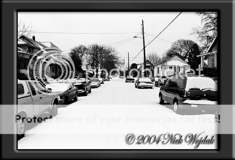
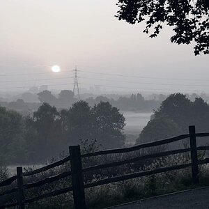
the freak storm 1st of its kind in 10 years hit and i strapped on my snowboard boots and went out and shot in "the hood" of portland

025_02.jpg


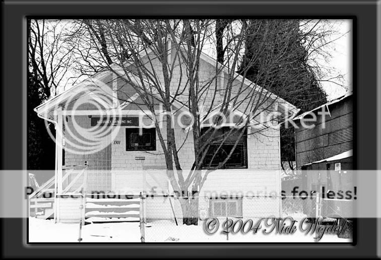
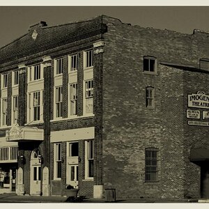
just an old house/business i found beauty in this old rickety house in the storm

011_01.jpg


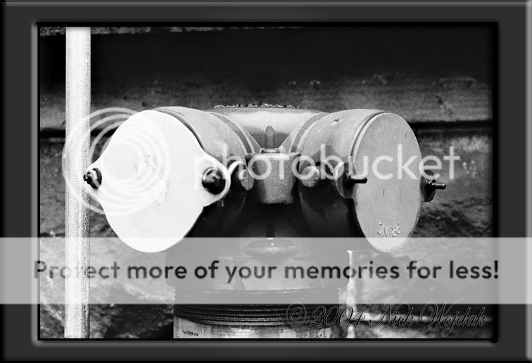
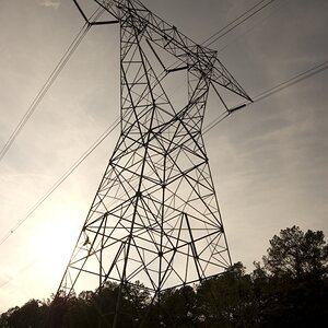
this shot to me speaks for itself and it defines the "TRI-X style" and why i love it!

005_05.jpg


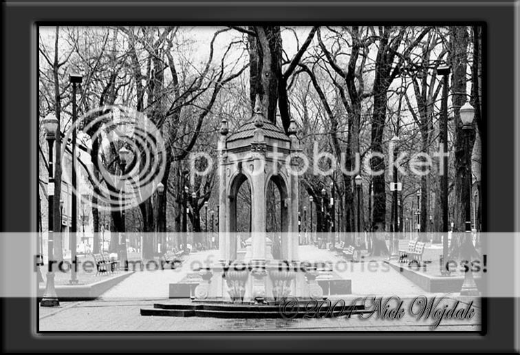
this shot was taken in a downtown portland park and i am a bit disapointed with the way this one turned out but the print i did of this same image in the darkroom is ten times better this one doesnt do it justice...

and finally...

003_03.jpg


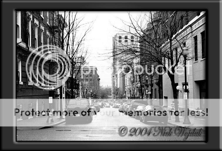
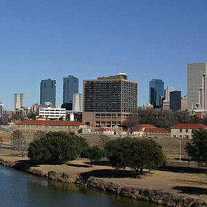
one of my many downtown city shots in portland....

ENJOY and THANKS
 
Photo 1: what is different about this photo from any I could take in my neighborhood by walking outside and snapping? (read as: there isn't anything of interest for me)

Photo 2: My eyes struggle to see what the sign says, either enlarge it enough to be readable, or get it blurry enough where I don't focus on it. Also rotating the photo until the walls are vertically straight would make it more asethicly pleasing.

Photo 3: Much better.

Photo 4: I think I agree with you, while the digital I see doesn't do much, I can definately see how the right print would be stunning.

Photo 5: Better than the first, but again not much to keep my interest. My eyes are drawn to the "one way" sign, and then it follows the sign back out into the street only to be left hanging.
 
Well unlike the forum newbie - I actually LOVE the first one - the white in that photo is absolutely beautiful...

I don't see the problem with the second one? I think it is quite nice...

The third doesn't really do much for me... I think it may be the left thingy seems a bit washed out. And personally - I would rather a dark photo that you can't really see detail in than a washed out one - but thats just me.

The forth is nice. not quite me - but technique wise i think it is nice and well done.

I also love the last one. I think I have an obsession with streets. lol... (and dead trees)...

My favourite is still the first one - I absolutely love the white... Snow is lovely when you don't live with it - I only saw it for the first time a couple of weeks ago. it was fun.
 
Hi, I would agree about decreasing the size of your sig and copyright - it draws the eye away from your image. That's not what you want.

I love a well-composed cityscape, and your last image is very good. Don't be too put off by the poster's comment about the One Way sign; I actually had to look for it to see what was meant. Signs CAN be a distraction when too large, but I think you get away with it here. The best part is the bare trees going into the sky. This image would not have its compelling starkness if the trees were in full bloom and if this had been shot in color. You've demonstrated a nice eye for what matters. Keep shooting! :D
 
thanks for all the input its much apreciated the copyright was just done real quickly to post here if i were posting it elsewhere i would have spent more time on it... and these werent necessarily the best shots i have just a quick few from the first 40 images so there will be more later today when i get home :) thanks again
 
sorry thought i had to add something here
jadin said:
Photo 1: what is different about this photo from any I could take in my neighborhood by walking outside and snapping? (read as: there isn't anything of interest for me)
did you not notice the 2FEET OF SNOW ON THE GROUND?? i realize up in miniesota 2 feet is probably nothing to you but from an orange county southern california born and raised kid 2 feet in a city is a massive amount so thats what kept my interest....
 
I like them all. 3 is by far the best closely followed by 4...I dont mind that the subject matter in 1 and 5 is a normal every day thing to see...the contrast and lighting make it more intreesting.
 
You're right on the snow, I see snow 8 months out of the year. . .

Just pretend I was in the 'critque forum'. I've been voting and commenting on photos all day, and my strategy has been 'what would I change?' instead of 'what was the artist going for?'. Which probably isn't the best way to critque.
 
its all good i undestand thanks for ur coments and also another added thing though normal for u those houses are inner city houses at about 100 feet above see level so it was quite an amazing feet to see snow in the inner city of portland especially that ammount of snow! but once again on the east coast thats normal hahaha but that kinda snow in portland stranded me there for an extra week cuz the runway has 2 inches of ice on top they couldnt scrape off because of the coldness
 

Most reactions

Back
Top