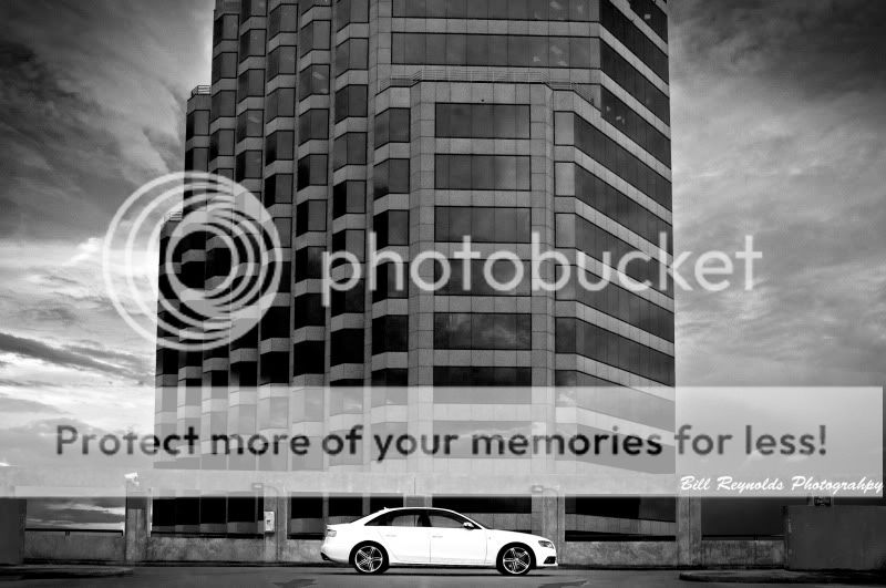
I have been somewhat contemplating that. the photo was shot for a Audi dealer and I wanted to be sure the car got your attention FIRST, then let your eye travel the photo. However, I think I maaaaaaaaaaaaay have over done it a bit. Maybe two clicks to many.
i think the sky in the second attempt just did not agree with the conversion. I had a lot of trouble even getting it to that point. second attempt wasn't as succesful but the photo was not as techincally correct to begin with. thanks for the comments. keep 'em coming.
Are you doing this for commercial advertising purpose for the dealership? In such a case, the art form is often less important. Black and white is about working with contrast. But you still have to decide if you are making something to meet some other objective, or for the art form. That can decide which picture is the better one. If doing this for a commercial client, then the client decide what is best, right? You just provide the options.
BTW, I'm curious what your method is. What I do is take color images and extract particular colors to represent in monochrome, in some combination (even negative). For people face pictures I start with the green channel as the only source. For landscapes I heighten the red channel.
its not as much as an advertisement as a photo replacement of some old stuff they have hanging at the store. There current photos they have around the store are from 2003 so definatley time for an upgrade. Thus far I have sent them 3 different shots with this car, all with their own variations, letting them decide. This was just my personal favorite while I was playing around with the shots. Since I don't do an overwhelming amount of B&W yet I tend to be drawn to it, I thought I would call on a few TPF opinions to check my work.
I started with a color photo and actually used the "image - adjustments - black & white" option on CS5. From there I played mostly with the blue,yellow,red channels to get what I was after. A little boost here and there with some other small tweaks was about it. I WAS converting it in Bridge but just never liked it....to bland.
Hi, I'm new here, so I hope that my comments won't be frowned upon. I also think the white car is just a tiny bit too white, but you notice the car immediately, so it works perfectly well as
a piece of commercial art. It's a very dark and powerfully atmospheric shot. Great work !
thanks for all the comments. personally after putting more thought into it appears I went more for the artistic approach instead of promoting the car. I think I will reshoot these, but i'm keeping this one! thanks all!
For me, I think you may just need to zoom in to the car more or crop the image a bit. It does draw your eye because it is bright (not overly bright imo) but then it seems to fade away into the scale of the shot. That massive building ends up being more of the focal point for me. Not much cropping... but juuuuusst a little!
But I think your application of B & W worked well on the shot! For me anyway!


![[No title]](/data/xfmg/thumbnail/34/34139-e52deba745f42ba091907fcc460cd6db.jpg?1619736311)
![[No title]](/data/xfmg/thumbnail/34/34140-74799834a513b0cbf28dfda9aeae291b.jpg?1619736312)
![[No title]](/data/xfmg/thumbnail/36/36423-4f4abd5f32da2219d4967c7a13b07a8c.jpg?1619737566)
![[No title]](/data/xfmg/thumbnail/32/32179-99b00fe3df8a5ed7303ced76980128fd.jpg?1619735235)

