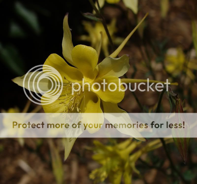
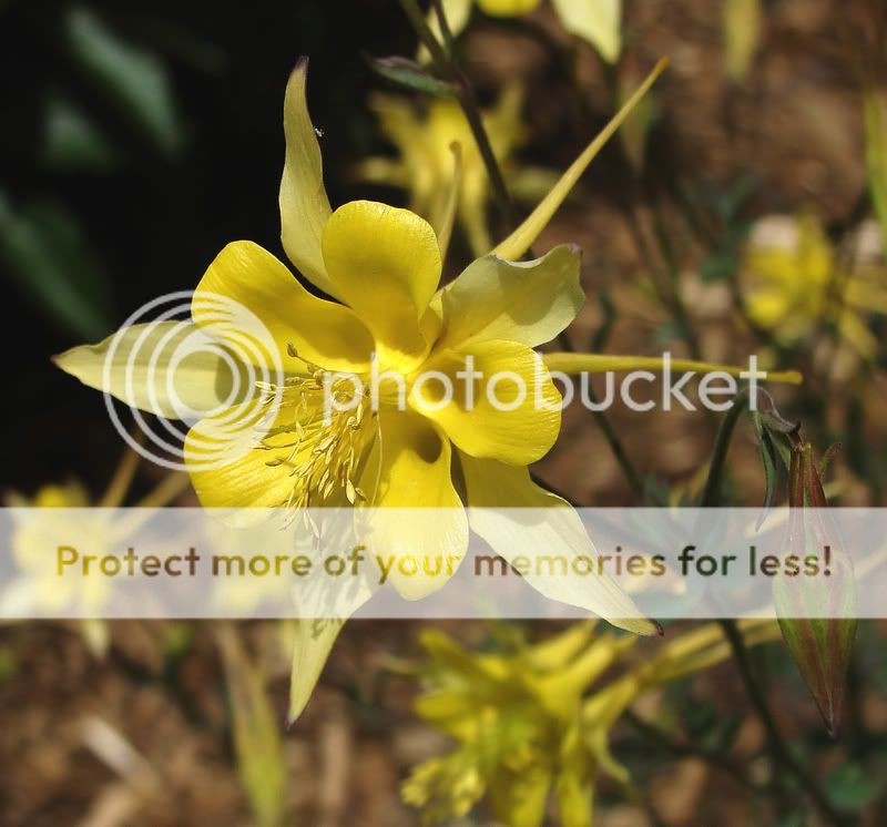
The edit of the first one is much better. The second one is slightly under exposed-- no where near as bad as the first was-- but could still use a little exposure bumping.
But they're both nicely composed images, with perfect sharpness.
I really like the comp of the second...the placement of the flower opposite the space make is look like it's falling or about to shoot out of the corner


")
![[No title]](/data/xfmg/thumbnail/42/42455-61fb2cf2ac4f6de557a508b2195fc822.jpg?1619740191)
![[No title]](/data/xfmg/thumbnail/42/42454-2589290b654fa7e0ffdd794aaa5cbd86.jpg?1619740190)
![[No title]](/data/xfmg/thumbnail/41/41755-a922f39cc29ff8f6e66a197508bf99f3.jpg?1619739881)
![[No title]](/data/xfmg/thumbnail/42/42457-a2cc06037a1ecaed84b9f0e5366fa8c7.jpg?1619740191)