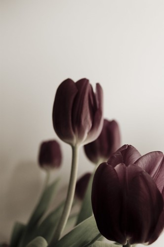
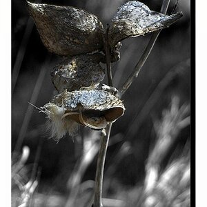
The foremost blossom (lower righthand corner) takes the focus, but large parts of that blossom are quite dark (and even went darker with the partial desaturation, maybe?), which I think does not do the concept much good. That one should show its being sharp and in focus all over, so I think. I'm also struggling with the amount of empty space in the upper left, I wonder what it is there for ... and the amount of room there but limited focus on the ONE blossom squeezed into the opposite corner makes me feel something about composition is not yet at its best... but that is subjective, like anything.
(Mind you, I am not all sure I like the partial desaturation, either).
I like this, a lot. You broke the mold by focusing the tulip in the lower right, and then broke the mold again with desaturation, and then broke the mold again with dark flowers...excellent. This is the sort of flower shot I love to see, it's the flower shot you haven't seen before, I love it. This is a really dreary take on something often associated with bright and happy and I adore it. Great work. Seriously.
Wow thank your for the high praise there Trenton Romulox. I'm glad you got the point of what I was trying to do with this one. I do get very bored of the perfectly shot and technically correct flower photos you see so often. I quite often find them uninspiring, and forgettable. I'm only just starting to get into flower photography and I am enjoying it a great deal. Its definitely my new thing for 2008.
Nice work, lomo. I like them all. :thumbup::thumbup:
For me the first photo would benefit from a little off the top and left side. I wouldn't say the second to last photo is 'muddy' but the color and exposure is a little odd. The actual flowers are a little too dark in that picture, IMHO.
The image is good but the composition of it can be better. If you moved your camera lower and to the right more, it would be a better composition to work with

")

![[No title]](/data/xfmg/thumbnail/35/35955-01e9c8140cdcaac10d227d68e42ac0d4.jpg?1619737267)
![[No title]](/data/xfmg/thumbnail/37/37111-64f64f2c8371420041bf39244ff12117.jpg?1619737882)
![[No title]](/data/xfmg/thumbnail/40/40304-a0ff25efbc1737761e8c4d43e2caa085.jpg?1619739412)
![[No title]](/data/xfmg/thumbnail/35/35953-1a8b92df0115ff7026f31b78855ac815.jpg?1619737264)
![[No title]](/data/xfmg/thumbnail/40/40301-fa48a5125a6849a0a400dff1599c4b30.jpg?1619739412)
![[No title]](/data/xfmg/thumbnail/33/33440-0778f3522902634844facab43c5a29fa.jpg?1619735969)
![[No title]](/data/xfmg/thumbnail/41/41493-60071420f928565170996b4edc3de2f0.jpg?1619739820)