vonDrehle
TPF Noob!
- Joined
- Jun 27, 2005
- Messages
- 430
- Reaction score
- 7
- Location
- North Carolina
- Can others edit my Photos
- Photos OK to edit

This is a shot of a turtle I got out of our pool the other day. I normally do landscapes and I'm just now venturing into animals and athletics. Just wanted to see how everyone thought about the composition and exposure. It came out a little dark but I really like the look it gives to the wood.
Canon EOS 5D
1/200
f/10
ISO 800
100mm
Thanks,
Chris
") I really like the colors. This little guy was a great find.
I really like the colors. This little guy was a great find.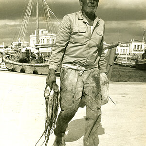
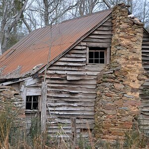
![[No title]](/data/xfmg/thumbnail/31/31092-7ba73f844ad8efedd3d5fd94799a866d.jpg?1619734609)


![[No title]](/data/xfmg/thumbnail/32/32929-22e23acc63d6ecb25e5ee941be87121f.jpg?1619735758)


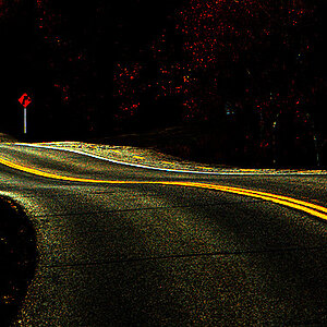
![[No title]](/data/xfmg/thumbnail/42/42349-fa3065c4e047f0114ec8715d9168dff9.jpg?1619740147)