Twilight Tower of Terror

vipgraphx

No longer a newbie, moving up!
Joined
Dec 1, 2011
Messages
2,415
Reaction score
440
Location
Some Where In the Desert
Can others edit my Photos
Photos OK to edit
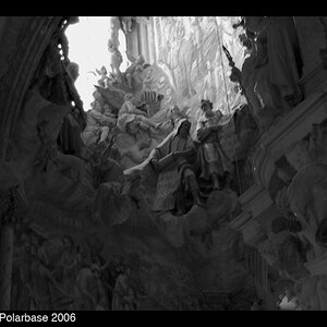
This one is from California Adventure. I went with the Black and white and added textures to this image as I felt it kinda went with that spooky old run down hotel look.


tower of terror by VIPGraphX, on Flickr

Hopefully folks will like the outcome of this.
 
Your images would look much better in my opinion, if everything wasnt falling over. You might like that over the top distortion, but it really ruins a good image.
 
That light pole bothers me to, but when I try to make straight the rest

Of the picture looks funky.

I will try the warp tool and see if I can fix it.
 
You might want to take into account the image you loose like the light pole if and when you straighten it up. But I like the processing here. I have a pic of myself and my kids going down that hotel ride. It was pouring rain at that time. Ah, the one I was in was Disney World not Disney Land. When I was in Disney Land I saw Walt there. He was actually in a New Orleans type street with musicans. I have a pic here of him somewhere. This was in 1969 or 1970.

30i9gyd.jpg
 
For this image, which is obviously going for an ominous, overbearing feel, I think the original works best...
 
For this image, which is obviously going for an ominous, overbearing feel, I think the original works best...

Yes, I agree...the well-corrected image Bynx posted has had excellent keystoning correction applied...and in some ways it DOES look better after his re-work. But I am not as fond of the more-precise,more-measure composition Bynx created by lopping off that right hand light pole's second lamp...the re-work looks more "controlled" and "studied", like a careful shooter shot it, whereas VIP's original shot had a more offhand, casual, 1920's feel to it...I think in a technical sense, Bynx's rendering of the source material (an effects-processed image file) is an excellent job, and that VIP's rendering of the source material (ie the hotel itself!) was not quite as well-composed as maybe it could have been.

The problem as I see it is those poles, and the way the camera was angled upwards...some people HATE keystoning....buildings and wine bottles and light poles that appear to be "falling over backwards" gets into an aspect of lens rendering that MANY people realllllly have strong feelings about. I think vipgraphix's original shot has just enough keystoning to look offhand and unstudied, but NOT enough to look super-creative and "cool".Using an entirely different focal length and a different camera placement (ie, HIGHER, like ladder-high), OR a camera with movements, or a tilt-shift lens, or maybe a 16mm rectilinear fisheye, would have made this shot and effect AWESOME....

BTW, I absolutely love that old,distressed, sepia tone "look"...looks fantastic on this California vintage architecture + palm trees. How about a re-shoot??? FABULOUS location for this processing/exposure treatment.

EDIT: As I was writing this, vipgraphixs posted his OWN re-work!!! ACK! I type too slow!
 
Darrel, great points, I still have much to learn! I how I wish I could go back and reshoot with no people in the way and my tripod but my vacation came to an end last saturday.

I think one problem with wide angle lenses is the great distortion it gives, as you said some people can not stand it while I on the other hand invested 2k on a lens especially for that so where do I go from here?

I really appreciate your time in your post and like I said great points, that I will keep in mind. I have been learning a few things here and there and maybe I should have taken this picture in portrait mode vs landscape.
Perhaps that would have helped out...

Thanks!
 

Most reactions

New Topics

Back
Top