Two on Two

Which do you prefer?


  • Total voters
    18

Gordon W

TPF Noob!
Joined
Jul 5, 2004
Messages
20
Reaction score
0
Location
Canada & USA
Can others edit my Photos
Photos OK to edit
(a.k.a. Pizza Parlor Stools) Here's a shot I took this week in a pizza parlor...

32383498.jpg


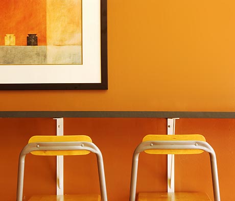
And here it is with the rightside chairback darkened so the chairs more closely match the values of the two objects in the painting on the wall. Do you think this is an improvement or not?

32413359.jpg
 
Gordon, that's an amazing photo. I like the retouched version, I would like one to hang in my living room please.
 
use them both 8)

awesome stuff.

i noticed that the table looks (slightly) tilted, but after whipping out a ruler, it's apparently flat :? i blame the painting. not sure yet what i think of this tilt
 
Hmmm seeing them next to each other, I don't like the imbalance the second has in the stools. Though if it was just the second one, without the original above it, it would be much much better.
 
Good work!

I'd prefer #1
 
#1, #1, #1 all the way! Jadin picked it off: the second one becomes unbalanced with the darkened chair back.

That top image is perfection! I wouldn't change a thing, except to get it blown up and framed. An awesome image! :D
 
I like the second one. Changing the color in the second keeps the harmony in the overall work. Awesome photo BTW.
 
Id use both, and reverse one of the images, so when you hang em on the wall the painting actually comes together.

Its a fantastic shot, Id love to see more stuff like this around the forum.
 
i like the original better - agreed, the image is perfection, and the chairs are real; as Mustrum Ridcully puts it, "WYSIWYGAINGW", that is, "What you see is what you get and it's no good whining" :mrgreen:
 
I like them both. To tell you the truth, I didn't notice the symmetry between the objects in the painting and the stools. So that means that either you were going for that and didn't pull it off, (to my eyes), or it's a really strong composition regardless, because I like it period :) The colors are fantastic as well.
 
Karalee said:
Id use both, and reverse one of the images, so when you hang em on the wall the painting actually comes together.

thats what i was thinking. display both of em together, and people will stare at them wondering at the profoundness of the diff. colored chairs :eek:
 
Thanks everyone for the comments. From the sound of it, either of the photos is acceptable. Not a bad position to be in, I guess. :)
 

Most reactions

Back
Top