echoyjeff222
No longer a newbie, moving up!
- Joined
- Jun 27, 2010
- Messages
- 643
- Reaction score
- 140
- Location
- WA
- Can others edit my Photos
- Photos OK to edit
Hi all,
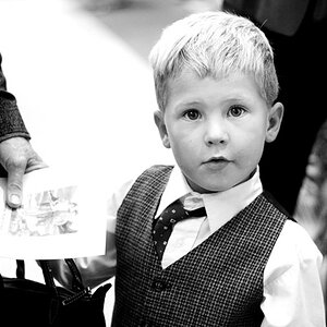
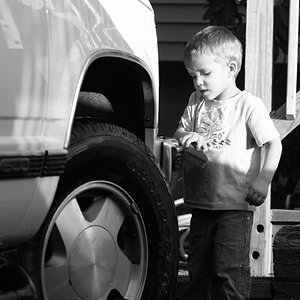
Our photography club had an outing this last weekend for portraits. I was hoping for some feedback on these two that I shot.
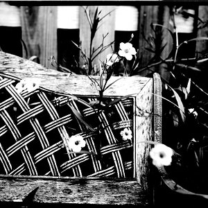
On #1, I was hoping for feedback on the PP. I like simple, clean edits, so I was going for that kind of feel.
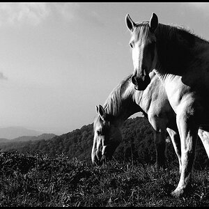
On #2, I was hoping for feedback on the conversion and crop.
General comments are also welcome to help me improve in the future!
Thanks.
#1:
 IMG_0646-2 by Jeffrey Lee, on Flickr
#2:
 IMG_0764final by Jeffrey Lee, on Flickr
Our photography club had an outing this last weekend for portraits. I was hoping for some feedback on these two that I shot.
On #1, I was hoping for feedback on the PP. I like simple, clean edits, so I was going for that kind of feel.
On #2, I was hoping for feedback on the conversion and crop.
General comments are also welcome to help me improve in the future!
Thanks.
#1:
IMG_0646-2 by Jeffrey Lee, on Flickr#2:
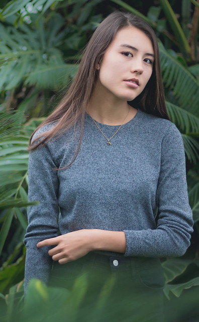
IMG_0764final by Jeffrey Lee, on Flickr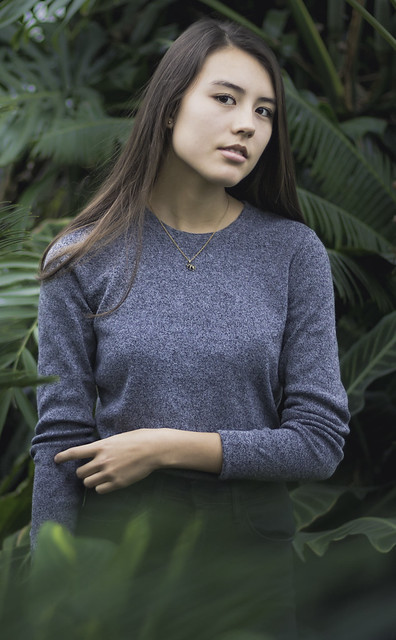 re-edit
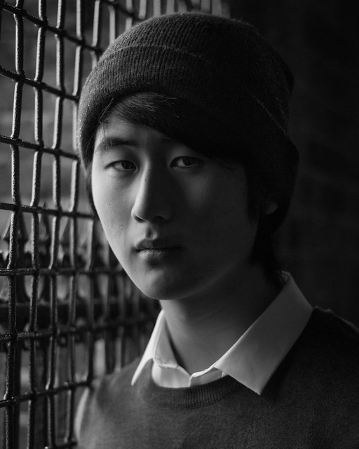 IMG_0764
![[No title]](/data/xfmg/thumbnail/37/37540-73002ccb910b97978bc38658622a34d3.jpg?1619738133)

![[No title]](/data/xfmg/thumbnail/34/34058-276eb00b31d5bfacf4028e7f729dc601.jpg?1619736257)