Urban Edge (Tim does HDR)

Tim Tucker

No longer a newbie, moving up!
Joined
Mar 23, 2015
Messages
660
Reaction score
579
Can others edit my Photos
Photos NOT OK to edit
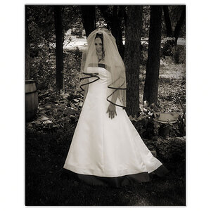
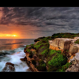
Don't think I've posted this before, and seeing as I've made a few comments without posting an image for a while... It's not really HDR but exposure blending, but I've been told by those guardians of exact definition that it's HDR, so HDR it is (until the exact definition changes). ;) I'm not a fan of using HDR (HDR as I describe it) as, firstly, I've never gotten it to work for me, and secondly I'm loathed to let the computer algor'whatsits to decide the finished result.

It's the derelict torpedo testing station at Arochar and was shot on the same day as "Broken Skies". I was drawn to the hanging chains and it reminded me of some of those old "shoot 'em up" video games, hence the over-processed look and the title.

View attachment 120316
 
Last edited:
I also like to do exposure blending it's needed, your is really well made because the shadow stays in shadow . Nice image!

Envoyé de mon 6045Y en utilisant Tapatalk
 
Very nice Tim, sorry I didn't have time to comment earlier.

You've got a pretty complex image here which is hard to pull off. A central horizon but the tones are a nice even split balancing the image well. My eye jumps from the distant island (is that the refuling depot?) and the geometric shape of the girders then to the chains an the right hand side. After that I see the sky and the gradiation from yellows to blue, then the clouds and the reflection in the floor and to the geometric girders again where I notice the small details of the sunlight just peaking through then back to the island.

Very nice split too, I like how the girders split the scene into panels, and you've balanced a complex scene really well. Lovely tones as usual.

I think this one is exceptionally well done.

I do have trouble associating Arrochar with the word "Urban" though ;)
 
I am almost giddy over the sight of those small, brilliant bits of sunshine that peek through the crevices on the left hand side!
 
I'm obviously an outsider in this, but I'm feeling kind of lukewarm about it. It seems like you've done a reasonable job of processing the HDR... it's a little dark, but I think that's really the way we'd see it ... maybe. Still feels dark.

The subject seems neat, and I like the idea of the broken up landscape, but the execution of that doesn't feel very impactful for me, personally.

Which only proves you have taste and style. :) Seriously, to make an image appeal to the widest audience you have to reduce it to the lowest common denominator. To do something different you have to accept that not everybody will like it and maybe nobody will like it at all. Then it's back to the drawing board. :rolleyes:

I am almost giddy over the sight of those small, brilliant bits of sunshine that peek through the crevices on the left hand side!

Ah, maximum contrast within the tones available. :)

Very nice Tim, sorry I didn't have time to comment earlier.

You've got a pretty complex image here which is hard to pull off. A central horizon but the tones are a nice even split balancing the image well. My eye jumps from the distant island (is that the refuling depot?) and the geometric shape of the girders then to the chains an the right hand side. After that I see the sky and the gradiation from yellows to blue, then the clouds and the reflection in the floor and to the geometric girders again where I notice the small details of the sunlight just peaking through then back to the island.

Very nice split too, I like how the girders split the scene into panels, and you've balanced a complex scene really well. Lovely tones as usual.

I think this one is exceptionally well done.

I do have trouble associating Arrochar with the word "Urban" though ;)

Thanks Pete. :) I can't help noticing that your critique and the way you evaluate images has developed a little. Excuse me if I "go off on one" again because there are a few interesting points.

Yep, the refuelling depot.

I like taking images from the inside of derelict buildings looking out. When you choose a derelict building and point your camera "at" the subject you see it as a part of the landscape, a view we're all used to. If you stand within the building and photograph through it then the building forms it's own edge or boundary between itself and the landscape. I think it becomes a more alien place, and you can place the viewer within it.

With colour I think the higher level of processing works better as it's more in keeping with graphic design and painting. When a painter (or graphic designer) looks at a scene they will see an almost maximum of colours in terms of hues, tints, shades and tones. A number they cannot replicate with the tools at their disposal. So they approach the subject with a limited palette and scale what they see into that palette. This is much the same effect as tone mapping and contrast boosts have on the colour of an image, they boost saturation by way of stripping back the variations in tint, shade, tones, and pastels to bring the dominant hues more forward. This gives you the reduced range of variation in colour and provides more in the way of blocks of similar colour.

With composition, I do not hold with there being a "rule" about the central placement of the horizon for instance, only an understanding of the effect when you do place the horizon there.

Think of your frame as being 1 bar of music, horizontally, vertically, diagonally, or a combination. That bar can be divided into equal and rhythmic pulses. Both your ear and eye is very good at recognising these accurate placements and equally good at recognising when they're just slightly off, (watch people straighten picture frames ;)). If you split your frame (or bar) into two pulses, the simplest rhythm, then you will see this effect very clearly. Take symmetry on the vertical axis, if you get it spot on then it's very powerful, miss it by a little and the effect is diminished. The effect also works on a horizontal axis but is diminished less (still prominent or accented) by mis-placement.
You can also can divide the image into three or four equal parts. Now just as four square 'drum and bass' sounds boring (when you stand outside the car ;)) so can exact accents on the square beats of your frame, central horizons, thirds, diagonals from the corners etc. Not that you can't do it, just that many photographers, either consciously or sub-consciously, play with the rhythm a little.

In the much quoted axiom "understand a rule in order to break it".

If you look at the perspective in the left and lower part of the image you'll see that it roughly follows the diagonals of the frame but does not coincide with them. Similarly with the horizon and more importantly the visual centre of the horizon. They are all slightly out of rhythm with the diagonals, they do not accent or draw attention to themselves:

View attachment 120388

Now this is the interesting bit. I knew before I pressed the shutter that I was going to crop to golden ratio, and I composed this purely by eye to get a visual balance in relationship to the rhythm of the vertical pillars and the image is, bar a little straightening, the full width of the frame. Now because we can judge geometrical shapes within the rectangle it's not too surprising just how much of the image (the verticals) coincide with rabatment along the two squares within golden selection, and because they do it becomes the stronger or more visible element (though it's structure is less obvious, more hidden):

View attachment 120389

As I said I balanced this by eye with the aspect ratio in mind, so do not suggest that geometry is critical to balanced images. But rather the reverse. Balanced images can coincide with strong geometry because that is the way the eye works in dividing up the rectangle in which you enclose your image. Geometry is not the function of balance but more the consequence, understanding it's effect can help in understanding composition.

As an alternative, you can line up the perspective with the corners of your frame, so called leading lines. But then perspective becomes the dominant beat, you loose the vertical rhythm of the pillars and your eye is ejected from the building at a more rapid pace. It's all about the rectangle. ;)

View attachment 120391

Arochar has a chip shop, how much more urban can it get? ;);)

Hope the above is of some help. :)
 
Last edited:
Computationally, it is spot on. I do wonder to a slight degree if there a bit too much light inside the structure given where the sun is coming from. Also, just as an aside, you seem to have some sensor dust issues.

tim.jpg
 
Computationally, it is spot on. I do wonder to a slight degree if there a bit too much light inside the structure given where the sun is coming from. Also, just as an aside, you seem to have some sensor dust issues.

Aye, my preferred version has deeper shadows. Trouble is when I display it against the very light grey of this web page they look overly dark and blocked so when I have an image of relatively darker tones I usually lighten it. Displayed on this web page full screened it looks right to me, but download it and display it against a darker background and it is too light.

I always have dust (it is a D600 ;)), and spot it out which is normally a "work in progress" so ta for the pointers (I have been known to miss a few). Photographers notice it because they understand it is created by the camera and separate from the scene, most other people don't because they usually just see the scene.
 
black border on the image does wonders.
 

Most reactions

New Topics

Back
Top