Urban Senior Portraits

twocolor

No longer a newbie, moving up!
Joined
Feb 26, 2008
Messages
1,044
Reaction score
227
Location
Utah
Website
www.twocolorphotography.com
Can others edit my Photos
Photos NOT OK to edit
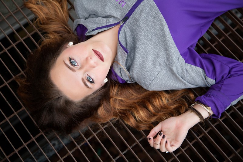
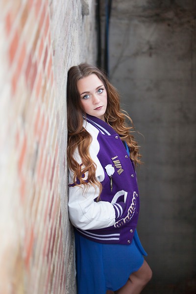
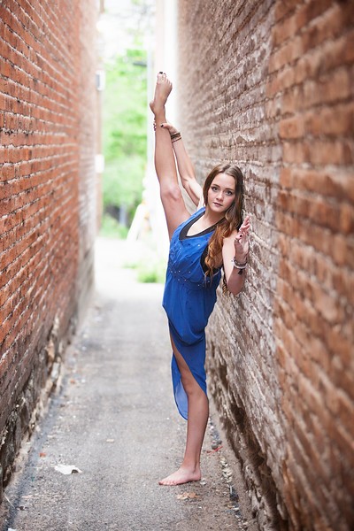
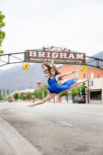
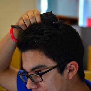
One of my Senior Reps for the 2015 class. The last class that I will be sponsoring senior reps. I changed my business plan to specialize in Newborns with a secondary specialty in families. I will still be photographing seniors, just won't be marketing to them.

1.
Madi%20Yeates%20012-L.jpg


2.
Madi%20Yeates%20015-L.jpg


3.
Madi%20Yeates%20036-L.jpg


4.
Madi%20Yeates%20043-L.jpg


5.
Madi%20Yeates%20052-L.jpg


6.
IMG_0084-L.jpg


IMG_0188-L.jpg
 
Killer. Very nicely done!
 
That last shot....soooo Katy Perry-like! All fundamentally sound, my favorites are 2,3,and 6. I bet your new babies and family areas of concentration will be a great success for you. You already have a very solid and much better than average technical and artistic basis under your belt!, and just really think you'll do great in those two areas!
 
the technical aspects are good, so my only niggles are with the more subjective stuff. So take it as just my opinion based on my own personal tastes.

1: lying on a drainage grate? walkway? color, focus and DOF are spot on. not really much else to say. im not normally a fan of tilted images, but i like how this one works here. nicely done.
2: solid shot. shame the floors so dirty tho.
3: not really digging the foreground/background location on this one. or the pipe.
4: this one....just seems like...i dunno...a weird pose for the dress and location. seems out of place to me.
5: brilliant. just brilliant. I think I would crop in a bit tighter though and get rid of some of the blown out space up top and a smidgen of foreground and make her a little more prominent in the frame. otherwise, a perfectly timed shot.
6: this was almost solid gold. I mean, it was right there at the edge of "holy #$&% that shot is great!", but the flare spots kill it for me. Behind the flare spots is an absolutely gorgeous pose and expression. For anyone that likes that sort of flare in their shots, they will need a towel after seeing this one.
7?: for me, this is what #6 should have been. this shot is beautiful. absolutely beautiful. her expression is wonderful, you simply nailed focus and what I consider perfect DOF for this sort of shot. This is magazine cover stuff.
 
Great set; outstanding lighting. Just make #4 go away. Not only does it seem very out of place, it looks to me like she's holding up someone's prosthetic leg (completely disregarding the fact that there's NO WAY the human body should bend like that!).
 
Great shots. My daughter dances competitively so I'm used to seeing the pose in number 4. I really like number 5 as it is very fitting for a dancer. I do agree that the crop on that one could be tighter. And the last shot is fantastic; I can't find anything to fault with it. Well done.
 
That last shot....soooo Katy Perry-like! All fundamentally sound, my favorites are 2,3,and 6. I bet your new babies and family areas of concentration will be a great success for you. You already have a very solid and much better than average technical and artistic basis under your belt!, and just really think you'll do great in those two areas!

Thank you Derrel! I came to a point in my business where I was so busy, and that excitement over a session was starting to wear off. The only sessions that I found myself consistently looking forward to were families and newborns. So I completely quit doing the one genre that I consistently dreaded (weddings) and started to really push into the world of newborns. Since publicly declaring that newborns were my specialty, I have more than quadrupled the income from newborns and I still am smiling at the end of the day!
 
the technical aspects are good, so my only niggles are with the more subjective stuff. So take it as just my opinion based on my own personal tastes.

1: lying on a drainage grate? walkway? color, focus and DOF are spot on. not really much else to say. im not normally a fan of tilted images, but i like how this one works here. nicely done.
2: solid shot. shame the floors so dirty tho.
3: not really digging the foreground/background location on this one. or the pipe.
4: this one....just seems like...i dunno...a weird pose for the dress and location. seems out of place to me.
5: brilliant. just brilliant. I think I would crop in a bit tighter though and get rid of some of the blown out space up top and a smidgen of foreground and make her a little more prominent in the frame. otherwise, a perfectly timed shot.
6: this was almost solid gold. I mean, it was right there at the edge of "holy #$&% that shot is great!", but the flare spots kill it for me. Behind the flare spots is an absolutely gorgeous pose and expression. For anyone that likes that sort of flare in their shots, they will need a towel after seeing this one.
7?: for me, this is what #6 should have been. this shot is beautiful. absolutely beautiful. her expression is wonderful, you simply nailed focus and what I consider perfect DOF for this sort of shot. This is magazine cover stuff.

Awesome, awesome critiques, thank you!
With #2 the floor was dirty, but it's the entrance to a cute little shop right off of the sidewalk on mainstreet, so it's dirty!
#4 is her formal uniform with the dance company she is captain of. They all wear this dress when they dance at half-times!
#5 I think a square crop would be amazing for this one
#6 I'm shooting through the fluer d' lis pattern of a light post. So the flare spots are the over exposed metal... this is the same shot, I just moved in front of the light post. Make this one bw??
IMG_0087-L.jpg
 
Great set; outstanding lighting. Just make #4 go away. Not only does it seem very out of place, it looks to me like she's holding up someone's prosthetic leg (completely disregarding the fact that there's NO WAY the human body should bend like that!).

Thank you! #4 - I think you just wish you could do that pose lol!! I haven't ever been able to bend like that, EVER! :)
 
the technical aspects are good, so my only niggles are with the more subjective stuff. So take it as just my opinion based on my own personal tastes.

1: lying on a drainage grate? walkway? color, focus and DOF are spot on. not really much else to say. im not normally a fan of tilted images, but i like how this one works here. nicely done.
2: solid shot. shame the floors so dirty tho.
3: not really digging the foreground/background location on this one. or the pipe.
4: this one....just seems like...i dunno...a weird pose for the dress and location. seems out of place to me.
5: brilliant. just brilliant. I think I would crop in a bit tighter though and get rid of some of the blown out space up top and a smidgen of foreground and make her a little more prominent in the frame. otherwise, a perfectly timed shot.
6: this was almost solid gold. I mean, it was right there at the edge of "holy #$&% that shot is great!", but the flare spots kill it for me. Behind the flare spots is an absolutely gorgeous pose and expression. For anyone that likes that sort of flare in their shots, they will need a towel after seeing this one.
7?: for me, this is what #6 should have been. this shot is beautiful. absolutely beautiful. her expression is wonderful, you simply nailed focus and what I consider perfect DOF for this sort of shot. This is magazine cover stuff.

Awesome, awesome critiques, thank you!
With #2 the floor was dirty, but it's the entrance to a cute little shop right off of the sidewalk on mainstreet, so it's dirty!
#4 is her formal uniform with the dance company she is captain of. They all wear this dress when they dance at half-times!
#5 I think a square crop would be amazing for this one
#6 I'm shooting through the fluer d' lis pattern of a light post. So the flare spots are the over exposed metal... this is the same shot, I just moved in front of the light post. Make this one bw??
IMG_0087-L.jpg

this version is absolutely fantastic.
i almost always prefer color over B&W, but i think a conversion of this shot would be better than the flared one.
 
My favorites are 3, 4, 6 and 7. The flare in six works for me. Great shots.
 
these are great. you have some ability...:1219:
 
the technical aspects are good, so my only niggles are with the more subjective stuff. So take it as just my opinion based on my own personal tastes.

1: lying on a drainage grate? walkway? color, focus and DOF are spot on. not really much else to say. im not normally a fan of tilted images, but i like how this one works here. nicely done.
2: solid shot. shame the floors so dirty tho.
3: not really digging the foreground/background location on this one. or the pipe.
4: this one....just seems like...i dunno...a weird pose for the dress and location. seems out of place to me.
5: brilliant. just brilliant. I think I would crop in a bit tighter though and get rid of some of the blown out space up top and a smidgen of foreground and make her a little more prominent in the frame. otherwise, a perfectly timed shot.
6: this was almost solid gold. I mean, it was right there at the edge of "holy #$&% that shot is great!", but the flare spots kill it for me. Behind the flare spots is an absolutely gorgeous pose and expression. For anyone that likes that sort of flare in their shots, they will need a towel after seeing this one.
7?: for me, this is what #6 should have been. this shot is beautiful. absolutely beautiful. her expression is wonderful, you simply nailed focus and what I consider perfect DOF for this sort of shot. This is magazine cover stuff.

Awesome, awesome critiques, thank you!
With #2 the floor was dirty, but it's the entrance to a cute little shop right off of the sidewalk on mainstreet, so it's dirty!
#4 is her formal uniform with the dance company she is captain of. They all wear this dress when they dance at half-times!
#5 I think a square crop would be amazing for this one
#6 I'm shooting through the fluer d' lis pattern of a light post. So the flare spots are the over exposed metal... this is the same shot, I just moved in front of the light post. Make this one bw??
IMG_0087-L.jpg

this version is absolutely fantastic.
i almost always prefer color over B&W, but i think a conversion of this shot would be better than the flared one.

Thank you, I'll go give it a conversion play... although that stray hair is now bugging me. Didn't catch it before, so I might go fix that as well.

My favorites are 3, 4, 6 and 7. The flare in six works for me. Great shots.

Thank you! :)

these are great. you have some ability...:1219:

Thank you! Makes a girl feel good to hear someone say that :)
 

Most reactions

New Topics

Back
Top