Jethro
TPF Noob!
- Joined
- Sep 13, 2011
- Messages
- 99
- Reaction score
- 11
- Location
- Prague
- Can others edit my Photos
- Photos NOT OK to edit
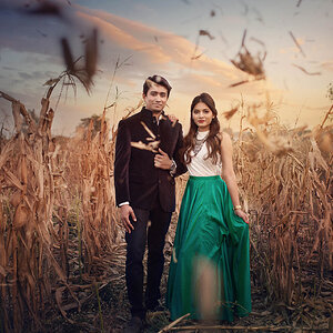
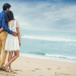
Another session with one of my friends ") whole set: Werush by Jetthro T at Coroflot
whole set: Werush by Jetthro T at Coroflot
Hope they are not too big
eq used: Canon 7D, Canon 50mm/F1.8

Uploaded with ImageShack.us

Uploaded with ImageShack.us

Uploaded with ImageShack.us

Uploaded with ImageShack.us
whole set: Werush by Jetthro T at CoroflotHope they are not too big
eq used: Canon 7D, Canon 50mm/F1.8

Uploaded with ImageShack.us

Uploaded with ImageShack.us

Uploaded with ImageShack.us

Uploaded with ImageShack.us
![[No title]](/data/xfmg/thumbnail/41/41779-303c41fcb3e37507cbe986d76dbfcf85.jpg?1619739890)
![[No title]](/data/xfmg/thumbnail/38/38734-a0c4ec46a440db881aca3700b0c62879.jpg?1619738703)
![[No title]](/data/xfmg/thumbnail/38/38738-7933157d1b8968c986eeeab2d1828524.jpg?1619738703)