Well, contrast is nice and ugly. Ugly where it comes to black blots where I still expect details. The building is "falling" - it needs perspective correction in PS if available. Sharpness is nice but it is not enough for picture to really catch my eye.
I don't know I may sound a harsh critic in this forum but my intention is to give a hint what can be done to improve pictures. Usually I need to know my weeknesses to move on and make my pictures better.
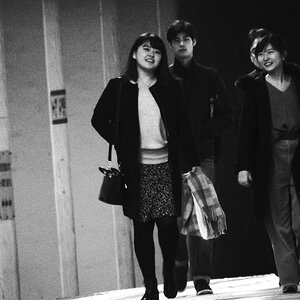
TOTALLY URBAN DISTINCTION! It has a jazz Harlem feel to it! LOVE IT! LOVE IT! kinda reminds me of the photo scene from Christina Aguilera's last album 'Beautiful'
If you had a black 1940s automobile, a man in a Gucci suit and three woman wearing CHANEL gowns, this would be a totally MAD fashion print! -try it and post it! hehehehe


![[No title]](/data/xfmg/thumbnail/31/31979-ea92aca54ae865842d998c9cec534991.jpg?1619735137)
![[No title]](/data/xfmg/thumbnail/39/39444-02925f6d2859f4fda0e89f2001bfc9cd.jpg?1619739034)
![[No title]](/data/xfmg/thumbnail/39/39446-903cfeac143cee6330a51546ecfdda92.jpg?1619739035)
