Website critique por favor?

nmasters

TPF Noob!
Joined
Dec 22, 2011
Messages
209
Reaction score
14
Location
Georgia
Website
500px.com
Can others edit my Photos
Photos OK to edit
Hey guys,
I just launched my website a couple days ago, and I have been working on it a lot lately.
I want this website to have a modern look that allows my images to speak for themselves.
The purpose of my website is to be an online portfolio for my work.

I'd really love to hear any kind of criticism! Don't go easy on me.

Thanks guys and merry Christmas!
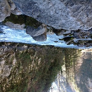
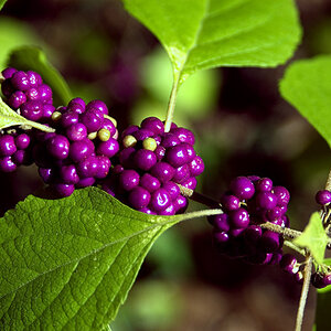
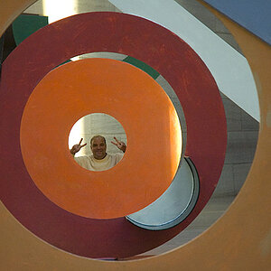
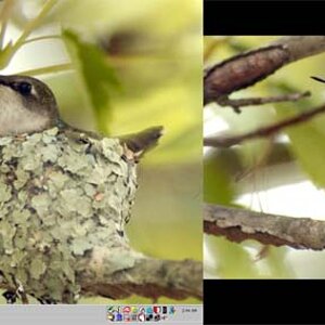
Masters Photo
 
I guess the first thing that comes to my mind is, "So what?" Why do you have a website? Can I hire you? If so, what's your experience, what are you specialties? What gear do you use? How much will it cost me? I also think you have way too many images. Ten good images are far better than 50 mediocre ones.
 
I guess the first thing that comes to my mind is, "So what?" Why do you have a website? Can I hire you? If so, what's your experience, what are you specialties? What gear do you use? How much will it cost me? I also think you have way too many images. Ten good images are far better than 50 mediocre ones.

Right now the purpose of my site is to display my work to models that I'd like to work with and other photographers that I'd like to assist for as I am still learning.

I don't provide any information on hiring because I am still learning and honing my craft, and I don't feel that I am ready to begin seeking clients.

I mention my experience broadly in my about me (been shooting for two years), and I also have a short blurb about the experience I have gained after interning with a professional wedding photographer.

I have never seen a photographer mention what gear they use on their site, and I personally don't think that it would make sense to list off the gear I use.

You're right about there being too many images, I'm going to try to cut them down a bit.

Thanks for the critique!
 
tooo many images... but that was already said...

good luck!
 
Putting that much effort into a website is commendable, but I think your portfolio doesn't do it justice.

Some of your shots are what I call "snapshots" and are not worthy of being posted on your website. I think it would show better if you culled your portfolio to include only your very best work. If it then seems kind of sparse, get busy making more photographs.

Also, just posting your portfolio is apparently what you wanted to do, but then what? Are you an aspiring professional? Do you want to be hired for more work?

Furthermore, some of the shots in "portraits" are not portraits. So I see the need to organize and sort better.

You've got some fairly good shots, but many of them still need to be re-shot or edited to bring out the best.

Good luck!
 
Right now the purpose of my site is to display my work to models that I'd like to work with and other photographers that I'd like to assist for as I am still learning.
Mention that.

I don't provide any information on hiring because I am still learning and honing my craft, and I don't feel that I am ready to begin seeking clients.
Outstanding! Again a line stating that you're a hobbyist showcasing his work is needed.

I mention my experience broadly in my about me (been shooting for two years), and I also have a short blurb about the experience I have gained after interning with a professional wedding photographer.
Fair enough, not terribly critical since you're trying to run a business.

I have never seen a photographer mention what gear they use on their site, and I personally don't think that it would make sense to list off the gear I use.
Again, not relevant for a hobbyist 'site, but I didn't mean 'this' lens or 'that' body, but more general such as still only, still & video, etc.

You're right about there being too many images, I'm going to try to cut them down a bit.

Thanks for the critique![/QUOTE]
One other suggestion; people have VERY short atention spans are are very lazy. Anything that isn't visible when the page loads is potentially wasted, so try and format pages so they're no bigger than the average screen size.
 
I agree, for a portfolio you probably don't need that many photos and probably want to pick your best. I think it's a matter of trying to look at your photos objectively and to differentiate between ones that you might like for a particular reason, and those that are the best.

The street photography section to me isn't the strongest because of so many that seem washed out or underexposed (or were edited to look that way?); I realize a lot of people seem to like that look but these seem to not be the best quality overall. But there are some that are interesting that might possibly be included as portraits - the man in the reddish tall hat/scarf (although I find the people in the background distracting, I'd try waiting a split second til they move into positions that fit better in your shot), 'Brun' Food Store reflection, they guy next to the statue (altho he isn't looking like he's real sure about being in your picture).

Some of the portraits that are interesting to me are the girl on the different color benches, the pool player in B&W and Thrive. The thing I'd think about are little distractions, the black shape near the guy's sleeve, the part of the white ID at the bottom of his lanyard (an easy crop) - I find my eye goes to those shapes and they're distractions because I find myself wondering what it is. Some of the B&W portraits to me seem grays more than black and white but Thrive is pretty cool and something different.

Your photos of the Smokies are very nice, I love the road and fence in the fog. Those are something different than what you typically see of the Smokies (I haven't been there in years and your pictures make me want to go back). Some of your photos are unique and those are the ones I'd think about showcasing on your site since they seem to stand out. I think some editing would be all you need as you obviously have talent.

Thank you so much for picking out those little distracting details in my images. I'm amazed how I overlooked those distracting elements. This is the best review I have had, thank you again, very helpful!
 
I will give you honest feed back on your site and take it for what it is worth. I have been in business since 2000. I started free lancing right after college and finally opened up a legit business in 2003 call pixel dust graphics. I specialized in logos, video processing and animation. A few years later I started doing many websites and here is where I can lend you a helping hand.

If you post pictures of just ok average out of the box pictures, you may not see return web users. The first impression is always the most important and the purpose of a this type website is to attract the attention of potential clients. You want to make sure the person viewing does not leave with negative thoughts about you and what you can do with a camera. You want them to leave that site and marking it in their favorites for later when maybe they need something. Thats what many people do thats why we have favorites.

Your website comes across like a personal flicker/facebook site just displaying all the pictures you have taken up to this point. YOur about me is somewhat negative and lacks confidence in what you are doing and why would I want to potentially hire you? After reading books yada yada yada you have evolved into a photographer, OK now what? What does this mean is it just a statement?


If I was you I would rework that site and the about me. Figure what you want to do with photography and rebuild your site accordingly. Pick a few your best pictures in each category and post those.

YOu do some decent stuff but, Honestly I would not book mark you in my favorites based on your site and your about me page probably more because your about me page.

Now the site is clean which is good so that gives me a positive vibe, its somewhat classy casual and not overly done. The type face I think you could pick a cleaner thinner classier font and use grey instead of black on white. I think your home page should not have all those pictures. maybe just your name and a click to enter, here is the reason. IF I clicked on a link that had your homepage and saw all those pictures I would think this is not very interesting and I would not enter your site. I lost interest to quick. Now lets say your work is top quality but, you could not get people into your site just because your home page…. You need to draw them into your site and keep them interested.

I hope this has helped. I have built many website for clients all over the world and have learned a lot from doing them.

Cheers!
 

Most reactions

Back
Top