
This_guy
TPF Noob!
- Joined
- Feb 23, 2016
- Messages
- 6
- Reaction score
- 1
- Location
- Washington, D.C.
- Website
- samuel-robbins.com
- Can others edit my Photos
- Photos NOT OK to edit
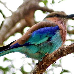
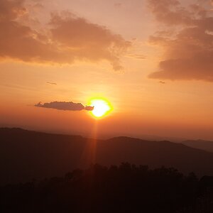
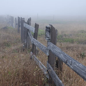
Hey guys! I published my website last month and am pretty happy with out it turned out! Would love some critique on the layout and how everything looks.
I used adobe portfolio to build it. Great web builder highly recommend it.
Samuel-Robbins.com
I used adobe portfolio to build it. Great web builder highly recommend it.
Samuel-Robbins.com
![[No title]](/data/xfmg/thumbnail/37/37607-69784b19e25bd0ba68e92ff4cfdfa8ff.jpg?1619738148)
![[No title]](/data/xfmg/thumbnail/34/34077-2933006a1d00efe7d5967044e94e345e.jpg?1619736268)


![[No title]](/data/xfmg/thumbnail/37/37630-10bda987ab220dc60e7c1cb65502f83c.jpg?1619738155)