flea77
No longer a newbie, moving up!
- Joined
- Feb 6, 2009
- Messages
- 593
- Reaction score
- 34
- Location
- Huntsville, TX
- Website
- www.allanhallphotography.com
- Can others edit my Photos
- Photos OK to edit
I am in an area flooded by photographers for your wedding, graduation, seniors, bar mitzvah, portraits or little girl's sweet sixteen party. There is however not one advertising commercial photographer. I have been doing some commercial work for some time now but never had business cards so I thought now might be a good time.
I too like the type of card that is demure, elegant, professional and understated. The problem is, every other photographer around has one of those, and they all shoot the same stuff, which I do not want to shoot.
So I designed these cards for two purposes:
1) Make the people seeking wedding photographers, seniors, etc all run away screaming.
2) Make business owners stand up and take notice.
What do you think? Did I go overboard? Is it too racy? Will I offend female business owners? Or will this card do exactly what I hope? Any and all comments are welcome.
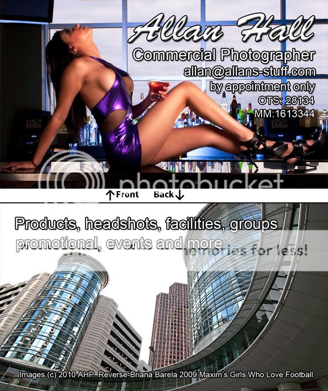
Allan
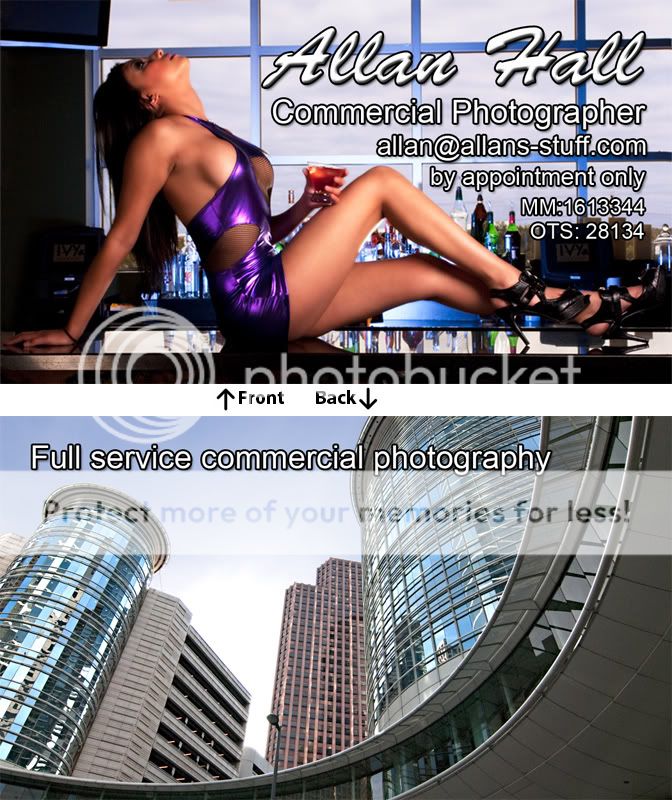
I too like the type of card that is demure, elegant, professional and understated. The problem is, every other photographer around has one of those, and they all shoot the same stuff, which I do not want to shoot.
So I designed these cards for two purposes:
1) Make the people seeking wedding photographers, seniors, etc all run away screaming.
2) Make business owners stand up and take notice.
What do you think? Did I go overboard? Is it too racy? Will I offend female business owners? Or will this card do exactly what I hope? Any and all comments are welcome.
Allan

") Looks kinda Penthousey to me.
Looks kinda Penthousey to me.![[No title]](/data/xfmg/thumbnail/31/31754-af76ae89cc75bd1855937374ff359efe.jpg?1619734992)
![[No title]](/data/xfmg/thumbnail/34/34075-a2fb0d7352396e58920e196958f6d006.jpg?1619736267)


![[No title]](/data/xfmg/thumbnail/42/42022-b164b48fbcd31e32040c4983ecb8983a.jpg?1619739981)