Welcome Home

IanRB

TPF Noob!
Joined
Apr 6, 2007
Messages
373
Reaction score
0
Location
Orange County,California
Can others edit my Photos
Photos OK to edit
I posted this in the general gallery, but i havent posted in the general critical analysis before so i thought i would put this one in. I took this in the airport at cancun waiting for my flight home. What are your thoughts on it?

1508826549_56f5ce01a0_o.jpg
 
Well, two immediate thoughts that spring to mind upon my very first glance:
- the horizon line is tilted and
- the crop is too close.

The tilt can be corrected easily, however that will take away even MORE of a photo that - to my mind - is cropped too closely to begin with, so the cleaning crew (or whoever they are - those dressed in white) will lose even more of their legs.

All in all the lines (wings -> [almost ;)]horizontal, steps -> diagonal, step vehicle bottom -> [almost
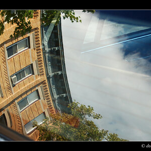
 ;)] horizontal again) are nice and well spotted, exposure on the sky is good, the clouds show some nice textures, but the too close crop takes away from it all, I feel. As do the other two things I pointed out (crookedness and cropped off legs).
 
I agree with what was said above.. also it seems a little uninteresting to me. Though that is just my taste.
 
i agree with you on pretty much everything is, i only wish i still had the original copy so i can fix the crop and tilt. Its on a macbook pro with cs3 that my uncle was lending to me but i had to give it back recently, so i guess i cant fix it really. thanks for the comments, keep em coming
 
I agree with what was said above.. also it seems a little uninteresting to me. Though that is just my taste.

Actually it is not just your taste at all. From the point of view of composition there is no real centre of interest and it is too busy. Being underexposed and black and white does not add any interest either.

skieur
 
The clouds for some reason look weird, still good, but bordering on goofy.
 
theres two much going on to focus on anything naturally, which makes it unintresting.
imo, itd be better if the color was retained, to keep the 'documentive' feel this has, more so then compositional/artistic.
 

Most reactions

Back
Top