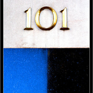
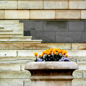
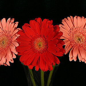
pretty nice site.
i would suggest getting rid of the second page or combining it with the 3rd or something, it's kind of a lot of clicking around as-is.
also, some of your images are sized wrong in the html... meaning the browser does wierd interpolation to get it to the wrong size, not good for image quality.
besides that, the photos are pretty cool.
what is this for? an online portfolio, or just for fun?


![[No title]](/data/xfmg/thumbnail/37/37613-6b200847731e552bb4bf9ba3bdb80183.jpg?1619738150)

![[No title]](/data/xfmg/thumbnail/32/32180-aee1597d1cfb87ae220637f19420b65b.jpg?1619735235)
![[No title]](/data/xfmg/thumbnail/37/37612-989c0c475619355f32a5941a187cfa74.jpg?1619738150)