What a difference a half stop makes.

voodoocat

))<>((
Supporting Member
Joined
May 15, 2003
Messages
5,275
Reaction score
17
Location
Gilbert, AZ
Website
www.voodoocat.com
Can others edit my Photos
Photos NOT OK to edit
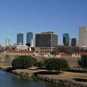
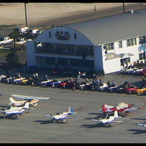
Here is proof you want to bracket tricky lighting situation. Especially when shooting with slide film, especially film like Velvia. The first shot I scanned and is what I posted to the gallery.

narrows02.jpg


Now for a half stop less exposure.

zionnarrows.jpg


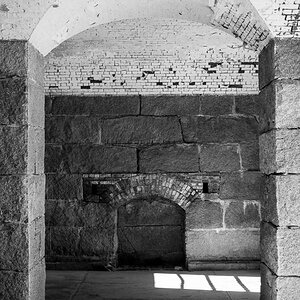
I'd like your thoughts. Obviously, it would have been nice to get a person in the shot to give it a sense of scale.
 
You liked the first one more? I liked the second alot more. Gives the sense of a setting golden sun. Much more vivid.
 
Havoc said:
You liked the first one more? I liked the second alot more. Gives the sense of a setting golden sun. Much more vivid.

my thoughts exactly!
 
I never mentioned which one I liked more... I do like the second one more. That's why I gave it a nice little border and some text :p

Even though it's only a half stop difference, the 2nd one just radiates and has a glow about it that I love. I've always bracketed for wacky lighting situations but this really has made an impact on how I'll approach exposure and bracketing in the future.
 
I figured you liked the 2nd best since it was all fancied up, but then it seemed weird that you would have posted the 1st in the gallery, unless you just hadn't noticed the 2nd yet or something...

Anyway... I agree, the coloring in the 2nd is really gorgeous. Nice work! Teach us all to bracket, won't it? :)
 
oriecat said:
I figured you liked the 2nd best since it was all fancied up, but then it seemed weird that you would have posted the 1st in the gallery, unless you just hadn't noticed the 2nd yet or something...

Anyway... I agree, the coloring in the 2nd is really gorgeous. Nice work! Teach us all to bracket, won't it? :)
Well I was briefly looking over the 3 shots I took and the first one I scanned had some detail on the left so I went with that. I still really liked the shot. So the next night I felt like printing one out which meant I had to rescan. So I decided to try the other exposure.... :shock:
 
I liked them both. I perceived both photos as abstracts. I thought they were nice examples of texture. I kinda leaned toward the 2nd a/c the more saturated colors and the greater accentuation of texture.

beautiful photos!

rebel
 
That's quite a huge difference. The second shot is better by leaps and bounds in my opinion. The composition is the same, and is great in both, but the deeper, more saturated colors give the photo much more impact. The tiny bit of detail lost in the rock wall on the left is not essential to the composition in my opinion. In fact, that wall being darker and black results in a nicer frame for the beautiful canyon color in the middle.

In layman's terms. Great photo!
 
Bet you didn't know borders change that much when you bracket

Smartass. :p

Impressive difference!! And it's this kind of color saturation that really proves the point. Very dramatic illustration of something that doesn't always show this obviously.

Nice work, and it's a fab image, not to mention a familiar and beloved place of mine. :wink:
 
You frighten me not.

I shall simply kick your walking stick out from under you and as you flail away for it I'll push you in the cold water of the Virgin River.... victory is MINE!!! :twisted:


Or, you know, you could stay on the east riverbank and I could stay on the west, till dark, then we could go get drunk at the Pizza/Noodle.... :D
 

Most reactions

Back
Top