
- Joined
- Mar 8, 2011
- Messages
- 25,157
- Reaction score
- 9,010
- Location
- Iowa
- Website
- pixels.com
- Can others edit my Photos
- Photos NOT OK to edit
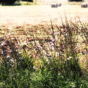
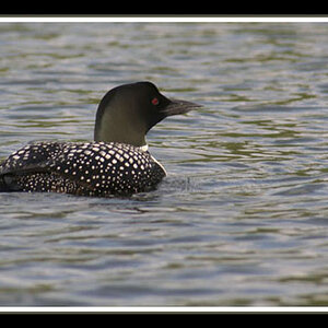
I used the Clone, Smudge and Blur tools.
Of course, doing this 'in-camera' is far better. Learning how to identify and avoid distracting backgrounds is your best tool. Work on that, then start worrying about clarity and 'pop'.
Of course, doing this 'in-camera' is far better. Learning how to identify and avoid distracting backgrounds is your best tool. Work on that, then start worrying about clarity and 'pop'.
") ).
).![[No title]](/data/xfmg/thumbnail/39/39480-e4e26ffe5c6148262ac81eff975a5c0e.jpg?1619739047)


![[No title]](/data/xfmg/thumbnail/34/34071-9d82cc63ea930e951f24480c250e35d1.jpg?1619736266)
![[No title]](/data/xfmg/thumbnail/36/36099-feb952513e45dbf9f061ab28c1dc1121.jpg?1619737342)