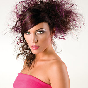
i like the feel. i wouldn't say that it's dark but it's definitely moody and i like that.
it might feel underexposed because her eyes are in a shadow. so if you lightened up around the eyes a tad it would probably help; just be careful not to make it obvious because it would look weird.
I like the toning and the light coming from the back. It gives it atmosphere. However, I do wish there was more of a catchlight in her eyes to really help to draw me in.
Her nose line is the brightest and most prominently-lighted thing in the frame, and draws my eye pretty strongly, I think mostly because it's so bright, and the face and eyes are dark. I wish there were more color and sparkle to the eyes...even from like a piece of aluminum foil, or a really weak LED light, or a 1/64 power teeny-tiny squirt of on-camera flash fired through like one of the ultra-mini 5x7 inch macro speedlight "softboxes" or even a styrofoam coffee cup jammed onto the snout of the speedlight...not enough light to really alter the real lighting....just something to add some sparkle to the eyeballs.
The way the camera is placed in relation to her? Just wonderful! Utterly,totally awesome camera placement. Slightly low, semi over the shoulder, neck wrinkles not too bad, bustline rim-lighted, her far arm lightly rim-lighted, the eye white area larger on one side (called "eye cut", which is associated with sexiness and feminine allure) than the other--all really, really nicely put together in terms of pose, focal length, framing, camera height. Even though the face and eyes seem dark, it's still a very "pretty" look at her. It might work brightend wayyyyy up. I think it could be made to work in another key.
I really like it just the way it is. The framing is excellent and personally I like the way the lighting shows the bone structure in her face. Good job!


")


![[No title]](/data/xfmg/thumbnail/33/33342-79274d7e5cdf3e52939255e1cd89f2d0.jpg?1619735911)

![[No title]](/data/xfmg/thumbnail/41/41762-58f644e561db7433f4f566037a965217.jpg?1619739884)