What can i do to improve?

Yes, you can sharpen it selectively, but there seems to be no selective masking option.
 
Yes, you can sharpen it selectively, but there seems to be no selective masking option.
If you're applying it with a brush, there isn't really much need to mask anything off, IMO. Just don't brush the parts you don't want the effect applied to...

edit
Nevermind. I think I see what you meant. The opposite of the brush, basically. Globally edit everything BUT 'this'.

Yeah, last time I used it, that was not possible.
(Not sure if that is still the case or not.)
 
I think that global masking will work on a selectively sharpened image. The unsharp parts don't really matter anyway and it will not be noticeable.
 
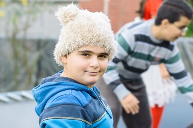
Here's the quick and dirty version of what I would do. This doesn't make the composition better, but it does help to draw the eye to the boy more than the guy in the background. The most distracting thing in the original was the red thing in the background, specifically at the top.

$DSC_8001a.jpg

Before converting from RAW format I brought the white balance temperature more towards yellow to normalize the boy's skin tone a bit. It may be a little too yellow honestly, but again it's the quick and dirty version. Then I brought the darks/shadows down to reduce the under eye shadow, brought the highlights down just a tiny bit to bring a little more balance to the face and keep the chairs in the background from being so glaringly bright, and then opened in photoshop. I used the healing brush to remove the red spots and the scar on the boy's face (this literally took 10 seconds), sharpened the subject and saved for web.

You could go a lot more advanced with the retouching, but honestly this photo probably isn't one that's really worth the time. It's probably not one you would ever use for marketing and the parents most likely won't order it from you.
 
After seeing it up on the web, I definitely think the skin is probably a tad too yellow, just one or two bumps on the white balance scale...

Oh, and if you wanted to get really picky with it you could select the distracting red part at the top and bring the saturation down. You can also select the part of the boy's face that is in shadow and bring the brightness up a bit on the RGB curve. I'm not super familiar with lightroom but it's fairly simple in photoshop.
 
Thank you, that is really the type of advice i was looking for. I'm glad some good came out of this thread after all and thanks again to the other few who also contributed, my editing skills will certainly only improve after this.
 
I spend way too much time playing with photoshop. It doesn't fix certain things, but in a pinch its great. Let me know if you need anything!
 
That is a pretty big part of photography, people forget that photography doesn't stop when you've taken the picture, it's why people complain about my composition when it wasn't really my question however justified they were in pointing it out. This was just a random snapshot i took that had different enough colours and things in it so i could dissect as much information out of it as i could.
 
That is a pretty big part of photography, people forget that photography doesn't stop when you've taken the picture, it's why people complain about my composition when it wasn't really my question however justified they were in pointing it out. This was just a random snapshot i took that had different enough colours and things in it so i could dissect as much information out of it as i could.


Your original question was what can be done to improve on how you've edited the image. Comments on composition are a very necessary response to that, because composition to a degree can be changed with editing and it certainly affects what editing is necessary.

My approach to any image starts with how to frame it. I almost always crop to a 5:4 aspect ratio rather than the camera's 3:2. I shoot a little wide to start with, full well knowing that will allow very precise framing later when I can view the image full size on a good monitor. Of course that also requires that first one has to decide exactly what the image is intended to be.

As I noted in a previous post this shot could be a straight portrait, could be and environmental portrait, or it could be one of at least a couple different styles of Street Photography. When I look at it, what I like is the Street angle, but not one of purist "Straight Photography" and instead something that leans back towards an environmental portrait. So that is the way I crop the framing...

I only want background showing the relationship between the central object and the surroundings. The excess dead space to the left is not needed, and for that matter neither is the detail around the fellow on the left. The red dress of the girl is grossly distracting and there isn't enough of her there to make it useful. She gets cloned out. Then the fellow on the right has to be "adjusted" to be less significant than the fellow on the left in all ways. We have no choice about that because he is already blurred. The trick is to make sure that what detail is there is not lost, but that none of it is distracting from the dominance of the right hand guy. Just the right brightness and contrast were needed. And that brought up an interesting problem because there is a blob of lighter area right on the bridge of his nose that becomes excessively distracting. Because it is blurred I can't tell if it is something he is wearing or something behind him. Regardless, it was cloned out.

The fellow on the left exhibits something not everyone will like, but I happen to favor unequal eyes. I always try to unbalance them to some degree, and this is a great case. I left the right eye as it was, but very carefully applied Unsharp Mask to the eye on the left.

This is the result:

dsc_8001.jpg
 

Most reactions

Back
Top