What do you think about my wife's website?

I see a lot of green and green/yellow skin tone color casts on non-effects shots. Meaning on shots that appear to be processed for "natural" color, and not "effects color", the fleshtones look bad.
 
Hey!
Its really nice to see a neighbor here. As far as format I liked it, was easy to navigate.
The only thing I wasn't really a fan of was the opening picture of the bride and groom (B&W) in the apple field (or whatever)
I personally would throw something with a little better comp and PP. Something to pull me deeper into the site.
Also some post on the photos are up and down... maybe the colors are off

Welcome to TPF.

More experienced professionals I'm sure will chime in.
 
Last edited:
Welcome!

As someone who is in the Seattle/Tacoma area and has been actively looking for a family portrait photographer in the last couple weeks because tripod + remote + posing myself + new baby is entirely too difficult for me, here are my comments.

I think the site is pretty nice & clean. However, I like to open different pages on different tabs so that I can switch back and forth, so I'm irritated when the right-click feature is disabled. I also like to look at exif data sometimes, but that probably isn't a normal thing for a customer to do...

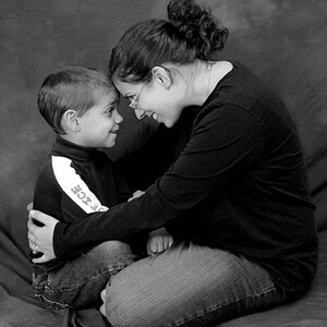
As far as the images, one major thing that jumped out at me was that in the family portraits, quite a few of the faces were not in focus.
 
Site is very quick and easy to navigate. Is that wordpress? Can I ask where she's hosting?
 
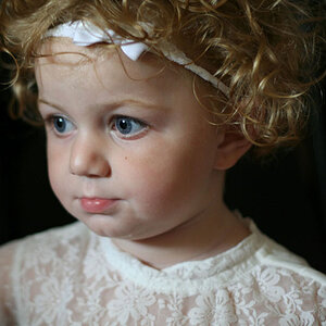
The photos she shows are hit or miss for me. There are a few that looks really good, there are a few that looks like she just bought the camera for a hobby.
 
I mean whatever, but I think they were asking more for feedback on the site than the pics. I point this out only because it strikes me as something that might devolve...
 
:lol: Be nice, Robin. Don't make me get Mish in here. :)

:whip:
 
I believe the hosting is done through Weebly - but I'll have to double check on that. Thank you so much for the constructive criticism (on the website AND the photos)! I think we will update a number of the photos on the front page. Some of these images are older, when she didn't have the best equipment. She just upgraded to the Canon 6d a couple months ago, and also got a couple new lenses.
 
I didn't check it all, but the majority of the pix I looked at were beautiful. The grad was kinda faded, maybe it was a 'bleach bypass' type of thing.

Strong opening shots for the portfolios. Very impressive!
 
More from a marketing perspective than photography (I'm at best a poor amateur), I think overall, it gives a quite positive representation of your work. I think the navigation provided is what prospective customers will want to see. But, I also think there are several photos (subjects) that may be detracting from the overall quality of the content on the site. I know I may not have stated this delicately and I apologize for that, but it is my honest opinion. We are not all beautiful (photogenic) people and I most definitely include myself in this category. Why put anything out there that is not the best of the best? I also don't see any proposition. Admittedly, I didn't look at every page, but I don't think you should have to. I think you have to ask for what you want from viewers - call, email, visit the studio, whatever - I didn't see that. I wish I was as talented at photography as you!
 

Most reactions

New Topics

Back
Top